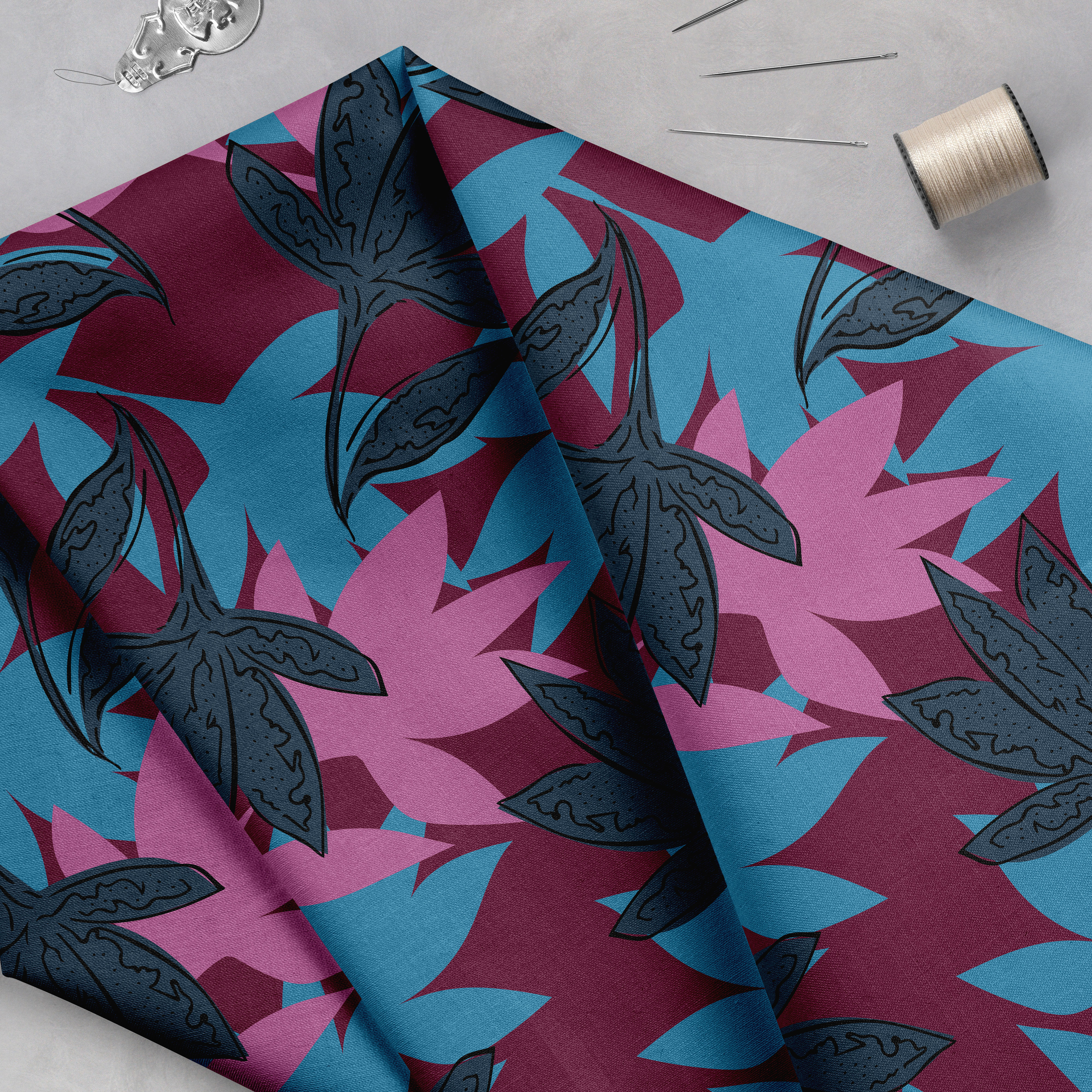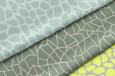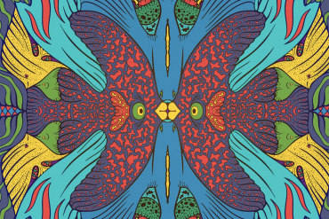
Each year, the Pantone Color Institute selects its Pantone Color of the Year, and for only the second time in...


At Pattern Observer we strive to help you grow your textile design business through our informative articles, interviews, tutorials, workshops and our private design community, The Textile Design Lab.
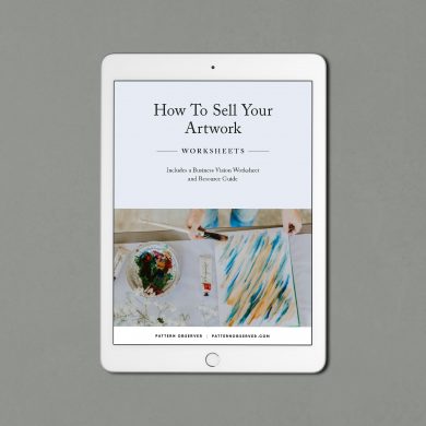 How To Sell Your Artwork
$7.99
How To Sell Your Artwork
$7.99