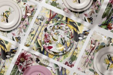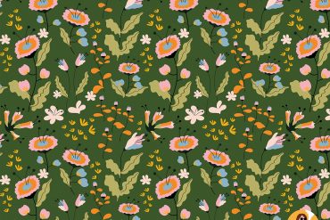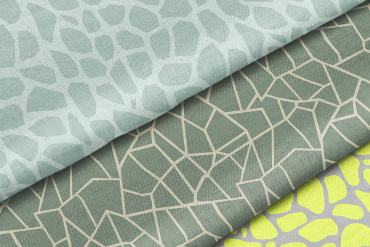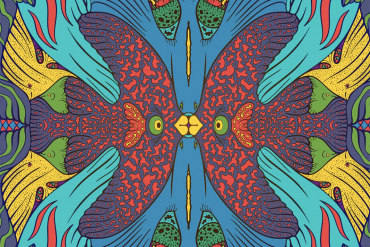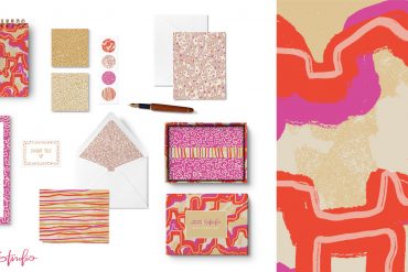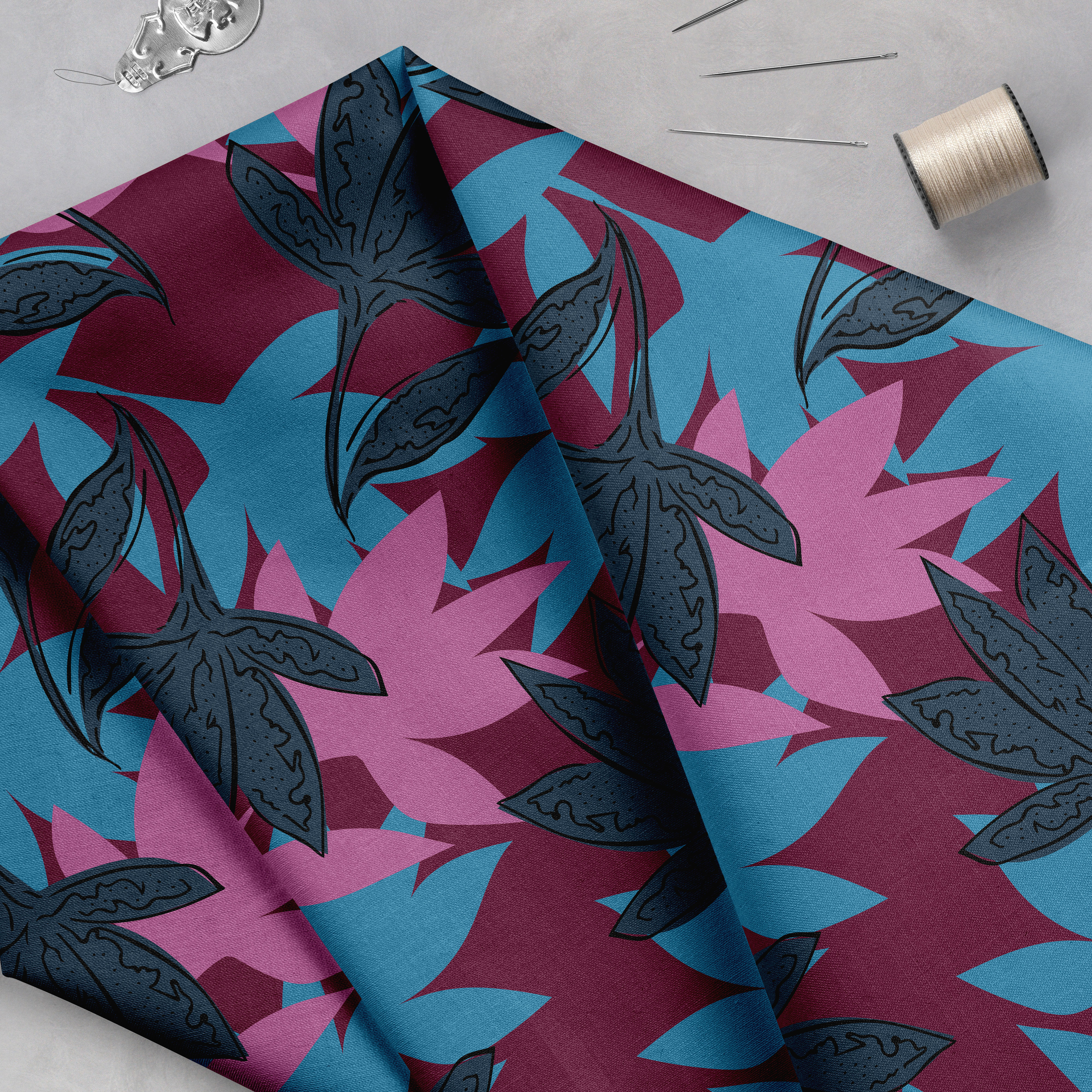


Interview by Chelsea Densmore. Images via sophicolor.com.
I’ve had the pleasure of getting to know Gwyn Marathas through our current Sellable Sketch Workshop, and when I found out about her awesome job as a color librarian at Precision Textile Color, and her work with their Sophicolor Collections, I had to know more! As a fascinating and sometimes mysterious area of our industry, Gwyn has been kind enough to shed some light on what life is like in color development.
Tell us a bit more about your design background/career path–how did you end up becoming a color librarian?
Both of my parents were artists, so I grew up surrounded by art, lots of color and creativity. I went to see the Unicorn Tapestries as a young teenager and that experience impressed me so much that I decided to study textile design.
I graduated in 1996 from UMASS Dartmouth in Massachusetts with my BFA in Textile Design/Fiber Art. I developed a love for Jacquard weaving and was fortunate to get an internship in a small “hobby” mill. After graduation, I landed a job as designer for Joan Fabric/Main Street Textiles in Fall River, MA. I designed and developed contemporary jacquard woven upholstery fabrics. During my time there, I was fortunate to view and choose from artwork brought in from around the world, always loving “sketch artist” days. It was a great experience since I learned so much about color, weaves and yarns as well. Not to mention testing and manufacturing.
Unfortunately, I had to leave after a few years due to conflicts with family time. After that, the American textile industry started to erode and jobs were disappearing. It took over a year, but I found a job locally (!) as a dye technician and colorist with a company that produced standards for the apparel industry. The company has morphed a bit over the past decade, but I’m still there today.
Could you talk about what Sophicolor is and what your role is there? What are your responsibilities? What are your favorite parts of the job and what do you find most challenging?
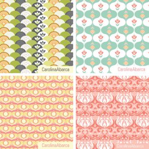
Sophicolor is an offshoot of our parent company, Precision Textile Color, Inc. PTC develops custom color standards and recipes for the apparel industry. Sophicolor was born through the creation of PTC’s color library. Sophicolor is a collection of 4500 colors that can be purchased as 3 boxed sets, either individually or complete. These 3 boxes contain 1500 swatches that are presented as an aesthetically pleasing palette. In addition, the recipes are included along with the digital data, making life a lot easier for color people to get through the color process in this global marketplace. We also provide software that is the first to show color accurately, in different light sources, on a calibrated computer monitor….globally. This means that a physical fabric swatch may not be needed anymore. Over the past year, Sophicolor has entered the trend market, providing fresh fashion colors in trend collections.
About the library: it would always bother us to throw out excess yardage of cotton colors just because they weren’t the “right” color. So, we started to store the excess in our archive space. For the last few years, I’ve been compiling the three collections of colors and reading their “wavelength signature” into our computer database to provide digital data in addition to the swatches for 4500 colors total, each collection has 1500 colors.
Presently, my role is to keep all the colors organized, in stock and process them as they’re ordered and “adopted” by clients. My favorite part of the job is working with clients and coming up with new ideas, we just entered the trend arena and that will be exciting as well. The most challenging part is keeping track of literally thousands of yards of fabric, as well as implementing a system to streamline the process. Right now, I’m in the middle of getting the colors all hung up on their own hangers (in my spare time, lol)

How instrumental do you feel color is in shaping trends? Do you find it plays a different role depending on the market, for example fashion vs. interiors?
As we know, and I can’t stress enough, color is what mainly drives the decision to buy one product over another. Look at Pantone, with its color of the year. That has certainly had a huge influence on all areas of trend-for good or bad (look at all the emerald green out there right now). Color for the home used to be quite different from fashion. But, over the last 40 years or so, the paint industry has been producing more and more colors as people have become less afraid of using color in their environment. Before, colors for homes could be characterized as muted and dusty, if not downright boring. Now, it’s commonplace to see bright colors throughout a home (for good or bad). I believe we’re much more aware of the power of color now. I see a blurring of apparel fashion and home fashion going forward. We are much more comfortable with our love of color. It’s a great thing.
Could you talk a bit about the Sophicolor collaboration with trend forecaster Hall Five? What was the process like between trend and color experts?
Since we’ve just started this venture, it’s still pretty new. Basically, Hall Five uses Sophicolors to illustrate the coming trends-they do the research, compiling this amazing information with visuals in the form of photo collage, and choose the trend colors. The result of this collaboration involves putting together a Sophicolor trend report, providing the swatches and other information needed to actually use them in production. We’re very client driven, so if any new ideas come in, we’re open to that as well. Who knows what comes next!

What are your go-to sources for design and/or color inspiration? Favorite blogs, books, etc?
My favorite books are art and design “coffee table” books…so much out there to further inspire new artists. I love the Dover books, too. Of course, visiting museums and stores…and-the internet has been a HUGE game changer for me for inspiration! ColourLovers, Kuler, Kolormondo, for color. Museum websites, artists friends pages and just general web surfing for pattern. We have instant gratification now…think/Google/look, there it is! I’m new to blogs and love the ones I’ve been introduced to through Pattern Observer.
Do you have a favorite color and if so, why that color?
I guess my enduring favorite color is purple. However, I’m a color fanatic overall. Having always been sensitive to trend, I tend to pick new/current favorites on an evolving basis. Last year it was a deep teal navy. This year, it’s school bus yellow, its all about yellow at the moment. I’m the type of person who can’t lay out their clothes beforehand. When I wake up in the morning is when I decide what color I need to be wearing that day. Strange but true, lol.
Do you have any advice for those interested in a career in color development?
Learn color theory. Really LOOK at colors. Look at the differences…learn to communicate what you see in a clear way so it will be easier for everyone to understand as a color is obtained. Get involved with groups that work with color for more information, education and support. It’s a fascinating world of color, just think, we’re only capable of seeing 30% of the colors around us. Also, there’s a LOT more to color than what meets our eyes. Explore that, too.
And-be flexible when evaluating color. We have the technology to measure color and the industry keeps tight tolerances for color measurement in addition to our visual assessment. However, sometimes a machine can keep saying “no” as our eyes say “yes” to a color. Fabric changes color with light and temperature exposure, giving different results. So, be aware of that, sometimes it’s ok to override the technology and still have good results (and less headaches, wasted time, etc.)