I am primarily an apparel textile designer, but I am trying to learn more about how textiles are used in interior design and why certain designs work and others do not. So…I am introducing my first installment of “On the Inside” a look at surface design, texture, and color trends in interior design. The idea is that I will choose an amazing photo from someone’s home, office, etc.. and pull out what trends & ideas that I (we) can use for inspiration. So..let me know what you think and if this is helpful at all. I hope you enjoy!
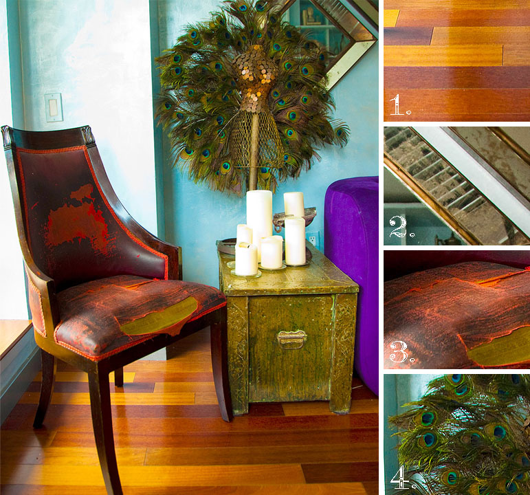
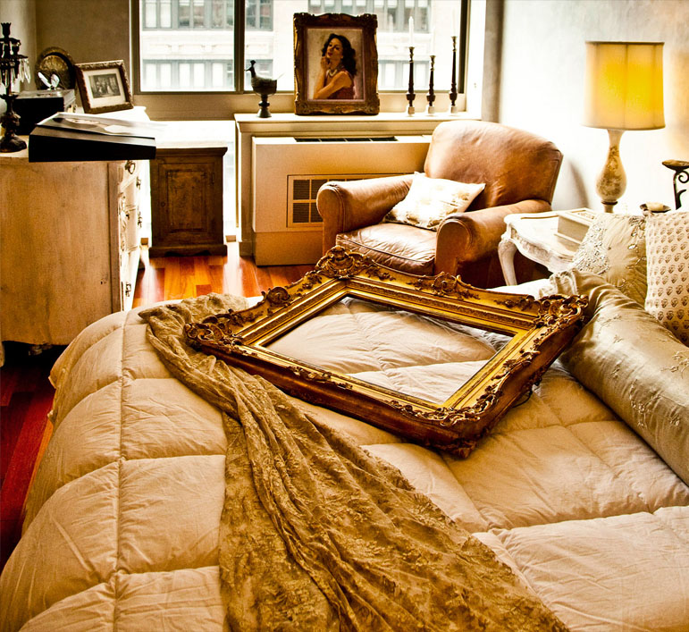
Today’s “On the Inside” photo is from model Coco Rocha’s lovely home in NYC. This photo struck me because of the beautiful use of color and texture. For example, the distressed leather chair against the grandeur of the peacock feathers and gold mirrors. The four ideas/trends that I see are:
1. Wood. A simplified version of this texture has been popular in graphic design for several years now, but I am totally digging the richness in color and the “broken stripe” feel in the floors. Think Rodarte spring 2011. It might be interesting to use it as an overlay over a floral print.
2. Rustic Shimmer. Grandeur seems to be coming back, but I think it will have a slightly dulled out quality to it..maybe a little worn. Which is what I love about this mirror. It has the shimmer and gold, but in a more understated manner. It is thinking, “I am kick-ass because of my imperfections.” We could all learn something from that mirror : )
3. Distressed. I just loved the patterns and textures you can see in the wear and tear.
4. Feathers. This is less about using actual feathers as a graphic element (so last season ; )), and more about the feeling that these feathers exude…unique luxury. The colors are also beautiful against that aqua wall.
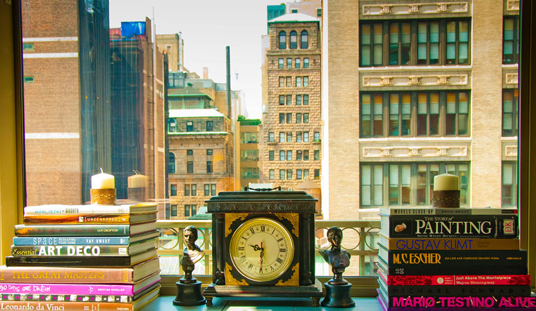
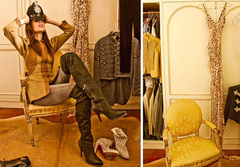
Here are a few more amazing photos from the shoot. Thanks to photographer Claiborne Swanson Frank and Vogue for the beautiful work.


