*post by Moi, images via: All apparel images from Aquilano.Rimondi Spring ’12 via vogue.com, “Florence” by Eusebius, “French Quarter” by Chad Kainz, “French Provencal” by French Finds
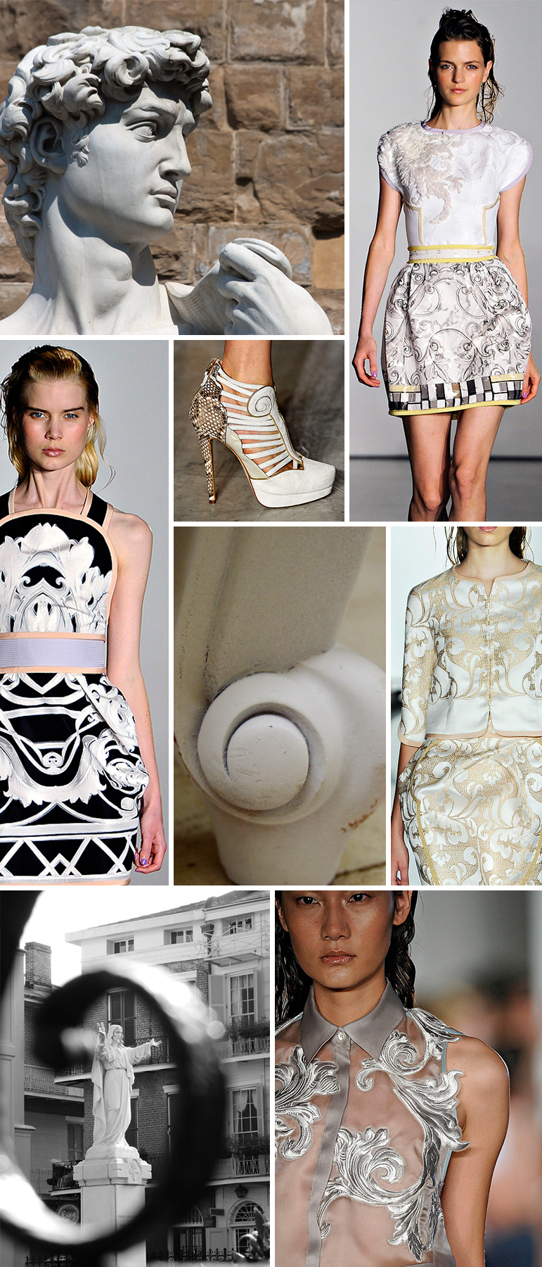
Hello there Pattern Observer! I know the Pre-Fall shows are starting to trickle out, but I am still wrapped up in all the trends that the spring runway had to offer. One of my FAVORITES, was Aquilano.Rimondi’s collection, which included an amazing collection of Renaissance-esque prints.
My big take-away from this collection is the concept of developing prints that appear as though they were carved out of marble. The color palette is simple, yet it creates such a sense of drama. Tints and shades of neutral greys and whites create a simply stunning palette. Just look at the palette that is created in Michelangelo’s David—the variety of greys is yummy.
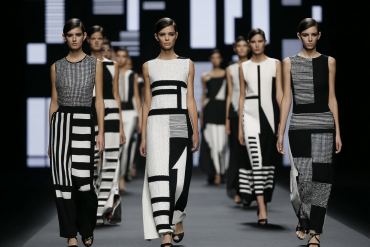
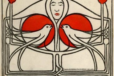
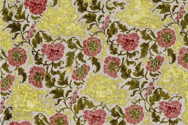
To make this trend speak to your customer, use images that they can relate to..birds, geometrics, flowers etc… For those customers that are looking for something a little less formal, try playing with scale and interesting placement prints. Enjoy!

