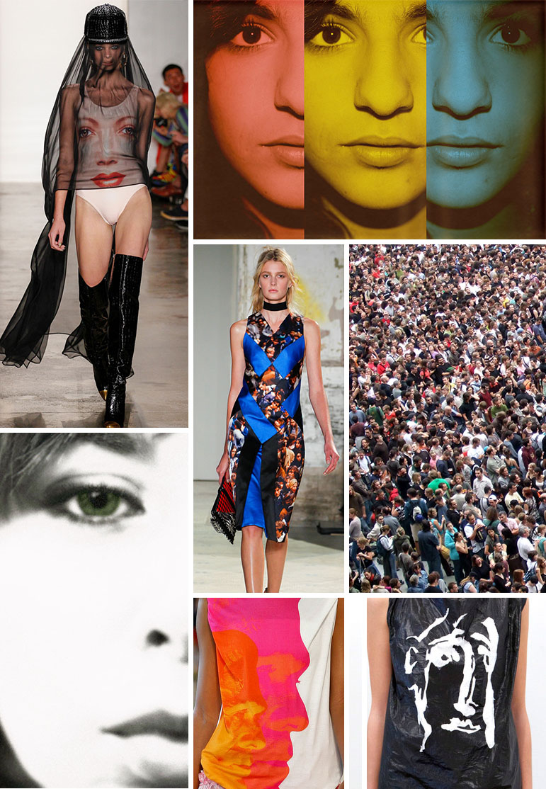
* images via: Jeremy Scott Spring ’13 via style.com, “Three faces” by ismomalle, “Crowd” by James Cridland, Bebe Spring ’13 via style.com, Christopher Kane Spring ’13 via style.com, “seeing green” by Katie Tegtmeyer, Proenza Schouler Spring “13 via style.com
I have been asked by several students if there is a trend site or blog that focuses on graphic placements in the textile design world. I have yet to find one, but I think it is a fantastic idea for anyone out there who wants to run with it! So..when Chelsea spotted this “faces” trend on the spring runway, I thought it was perfect for those of you who are in need of some graphic inspiration.
The trend is widespread, from photorealistic to abstract, and was all over the spring runway. Chelsea counted 10 brands with face images being used, including: Aquilano Rimondi, Bebe, Christopher Kane, Custo Barcelona, Dolce and Gabbana, Fashion East, Jeremy Scott, Maki Oh, Proenza Schouler and Viktor & Rolf. That is quite the lineup!
Remember, unless your target customer is the trendiest of the trendy, the runway is a great place to look for inspiration. If a print style or graphic is popular on the runway, this doesn’t mean that the trend will not be popular in more affordable markets in a year or two. Just think about how long the owl trend has been around. So if this trend interests you, think about how you can interpret it in your own style and in a way that speaks to your customer.
Have a great week! – Michelle

