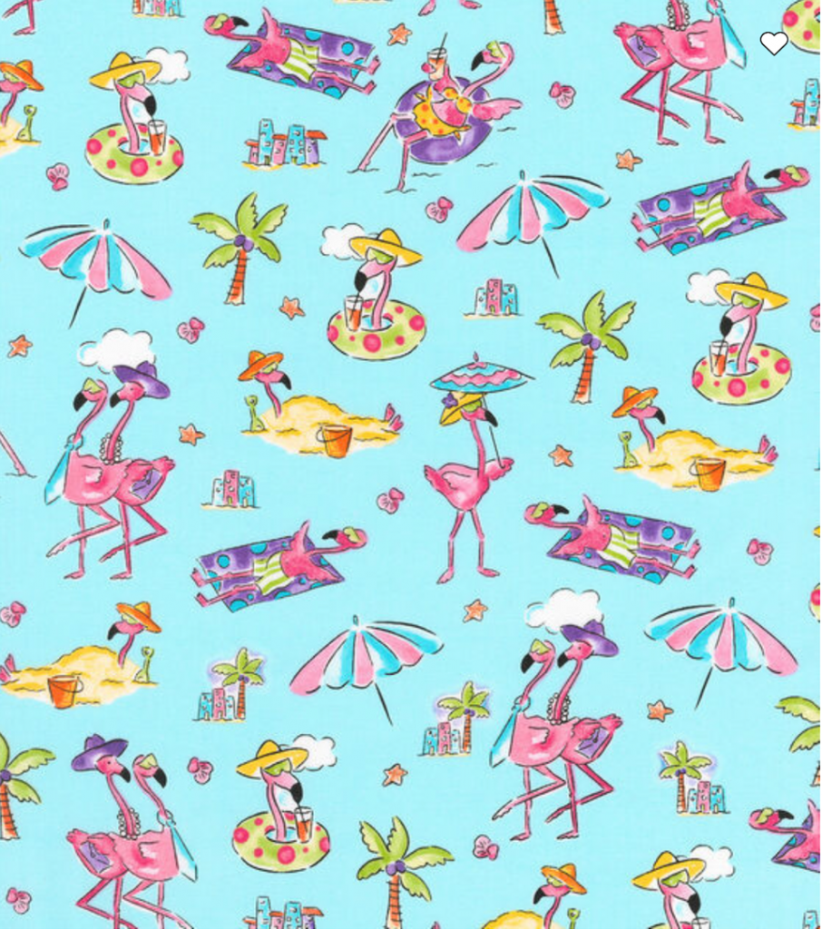
MaryJane Mitchell has a flamingo pattern that’s been selling for seven years. This pattern is printed by Kaufman, and still going strong.
That’s not the kind of success we talk about much in this industry. We talk about the new trend, the bold direction, the creative breakthrough. We post the experimental colorways and beautiful mockups, the work that stops people mid-scroll.
But if you’ve been doing this for a while, you know something else. You know which patterns actually pay the bills. And they’re rarely the splashiest thing in your portfolio.
The Quiet Confession
It’s common for designers to hesitate before showing a tossed floral. Downplay a coordinate. Apologize, almost, for a pattern that isn’t “the most exciting.”
Meanwhile, that coordinate gets licensed. Gets reordered. Gets re-colored for a new season. The bold statement print? As much as it breaks our hearts, sometimes it sits in the files.
There can be a strange embarrassment that creeps in when you’re staying busy creating the versatile, reliable, timeless patterns. Like you should be doing something more. Something different. Something that proves you’re still pushing yourself creatively. I’ve been there a few times in my career.
In this post, we’re discussing why these patterns are so important, celebrating the designers creating them, and hopefully opening designers’ eyes to what’s possible in our industry.
What MaryJane Knows
MaryJane Mitchell has been designing for the children’s and quilting markets for over 25 years. When I asked her what patterns have been the backbone of her career, she didn’t hesitate; it was that flamingo. That’s one lucky flamingo!
She also has a llama pattern with Kaufman. MaryJane knows what works and she leans into it.
When I asked if she ever feels pressure to design something more “groundbreaking,” her answer was refreshingly direct: “Not really. I love quirky designs.”
She has confidence in what she knows to be true after decades in the industry.
The Banana Pattern
Andrea Kauffmann is another experienced designer who has a beautiful, poetic connection to the timeless work she creates. When I asked about patterns she’s proud of, not for being the loudest, but for how well they worked, she talked about her loose, imperfect, acrylic paint bananas.
“It was never meant to be the most ‘show-stopping’ design in the collection,” she told me, “but it carried so much heart from my roots in Brazil. That pattern reminded me that success doesn’t always come from being the splashiest. Sometimes it comes from making something that feels real, warm, and genuinely joyful.”
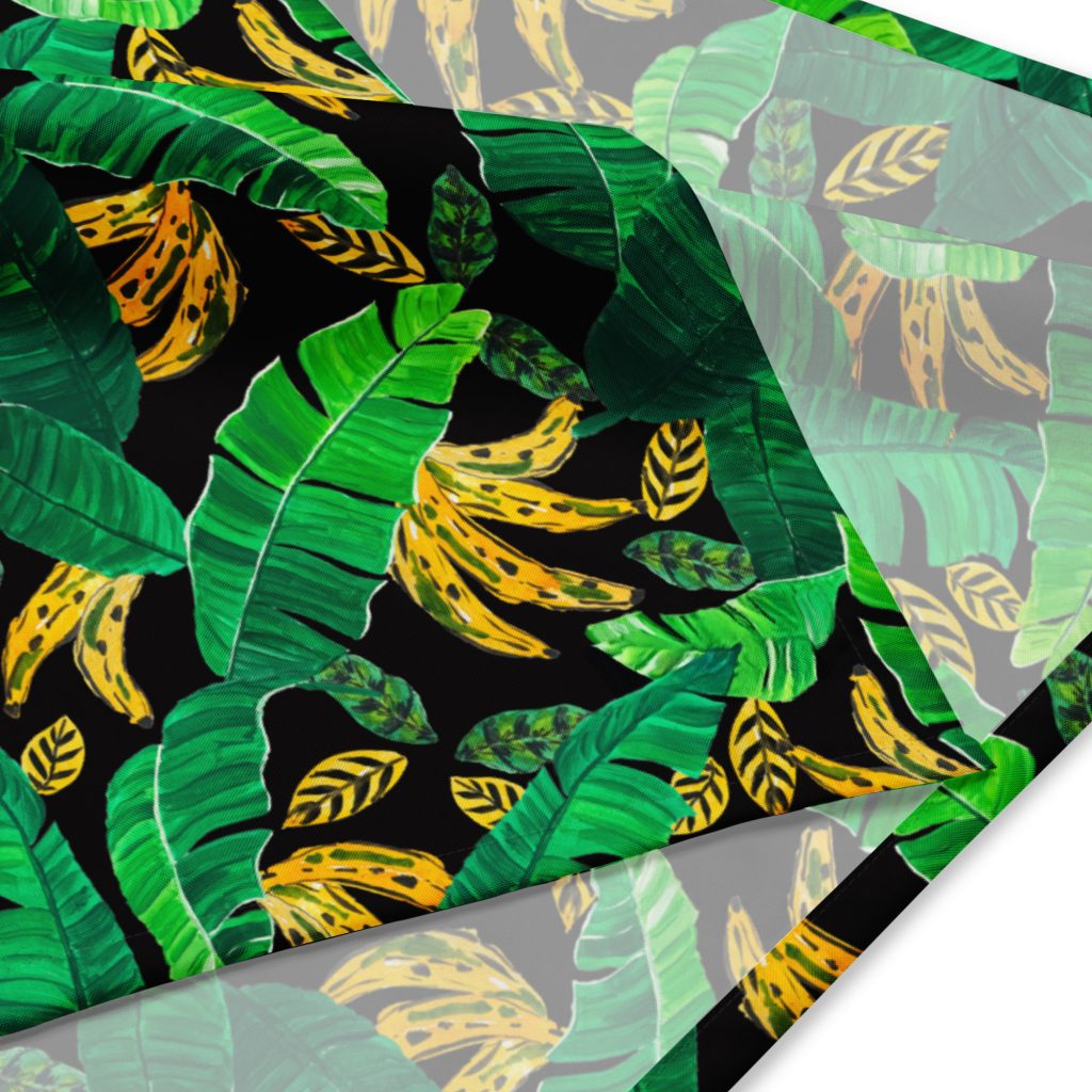
Andrea’s been asked the same question we all get asked, internally or externally: Shouldn’t you be doing something more groundbreaking?
Her reframe is worth sitting with: “Innovation doesn’t have to come from abandoning my core motifs and style. For me, ‘groundbreaking’ is about how to evolve a familiar idea, through color, scale, placement, or context.”
That’s not creative stagnation. That’s creative depth.
The Real Skill
There’s a misconception that coordinates are what you dash off after the “real” design work is done. Filler. Supporting players. I’m guilty of this one as well.
But making something that works across a collection, that plays well with hero prints, that buyers can actually use, that holds up season after season, that’s not the absence of skill. It’s a different kind of skill.
Andrea put it well: “A tossed floral or a quiet coordinate can be incredibly powerful if it’s rooted in your point of view and the emotions you want to evoke.”
The key phrase there is rooted in your point of view. A great coordinate isn’t generic. It carries the same intention, the same sensibility, as your boldest work. It just does a different job.
What Actually Sells
Trends cycle through, some quicker than others. And while I adore working with trends, and understand their importance in our industry, I love the staying power of a well-designed coordinate, a stripe, a dot, a tossed small, a blender with personality. It gets re-colored. It gets scaled up and down. It becomes the reliable seller that keeps your licensing income steady while the statement prints come and go.
This isn’t a secret. Buyers know it. Product designers know it. The designers who’ve been doing this for decades know it.
The only people who sometimes forget are us designers, scrolling through feeds full of bold work and wondering if our quieter patterns are “enough.”
Celebrate the work
The quiet pattern isn’t a failure of imagination. It’s not a sign that you’ve lost your edge or stopped growing. It’s evidence that you understand something essential about how this industry works. About how collections are built. About what makes a pattern not just beautiful, but useful.
Andrea said something that stuck with me: “Staying connected to your own values and being loyal to your artistic instincts is what gives work longevity and meaning.”
Longevity and meaning. That’s what we’re actually after, isn’t it? Not just the dopamine hit of a viral post, but a career that sustains. Work that gets used, reordered, remembered.
So here’s to the flamingos still selling after seven years. The bananas that carry the heart from Brazil. The coordinates that shine in collections. The patterns that aren’t the loudest in the room but keep getting invited back.
Design them well. Value them openly. And let’s celebrate the work!