Each month Sherry London will be bringing The Textile Design Lab an in depth post on how to improve our design process by using technology to its fullest capacity. This is an excerpt of a longer post available to members of The Textile Design Lab. Join us to access the full post!
*March Tech Talk by Sherry London
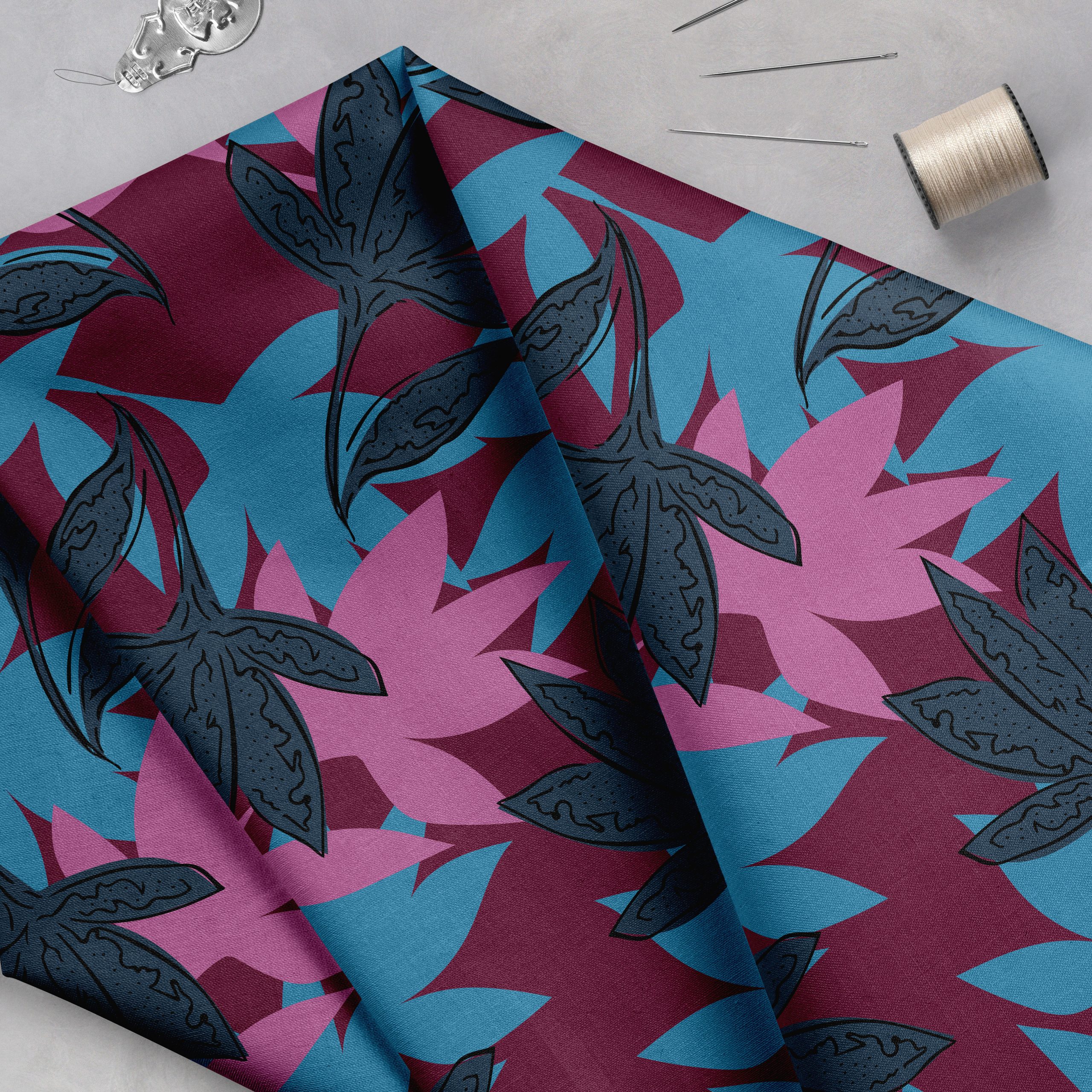
Many designers prefer to use Photoshop but then run up against the color limits of wet (screen) printing. Wet printing is still quite commonly used in the textile industry. Where each additional color increases the production cost of the fabric, designers sometimes need to cut their number of colors quite drastically.
The thing that I find so ironic about this is that when I first started using Photoshop and computer graphics back in 1990, indexing was the norm—not the exception. My first PC could only display 8 or 16 colors. Some of the earlier computer systems could only do black and white (or grays as in the first Mac in 1984). I had a test version of the first Hercules card that did, I believe 128 colors.
In those days, it was very easy to find programs that let you manipulate colors and pick the ones that worked best for your image. Many companies, long since out of business, made plug-ins for Photoshop that let you color separate for screen printing.
You can still find purpose-made solutions, but they are now very expensive. Except for one that I found that is a low-cost plug-in for Photoshop, most everything I discovered whilst researching this article was quite costly. Tip: if you need to enter your name and address for a salesperson to call to “discuss” your needs, you probably can’t afford the solution!
What is Indexed Color?
Indexed color is a color mode that can store at most 256 entries in its table. In a “normal” file, Photoshop stores the color data for each pixel in the file on a pixel by pixel basis. Each location in the file can have a unique pixel color.
For an indexed color file, it’s easier if you picture a series of buckets. A 12-color file would have 12 “buckets” (figuratively, of course!)
Now, instead of keeping the exact color of the pixel, Photoshop adds an index entry—much like the index of the book. Instead of saying that the book talks about “Color” on page 12, it would say that the pixel on the image at Row 1, Column 15, for example, uses bucket 6 for its color.
The advantage of this scheme is that that pixel always uses bucket 6 and even if you alter the color in bucket 6, it still gets it color from that bucket. Indexed color also means that you can change the color of every pixel in your image that used bucket 6 without even making a selection. Just editing your color table alters the pixel colors.
How to Index Your Colors
The physical process of indexing an image is really simple. All you need is a file and Photoshop. You choose the command Image > Mode > Indexed Color and enter the number of colors you want in the file, and click OK. Presto! You get an indexed color file. There’s only one little, bitty problem with this. It’s is usually UGLY!!!
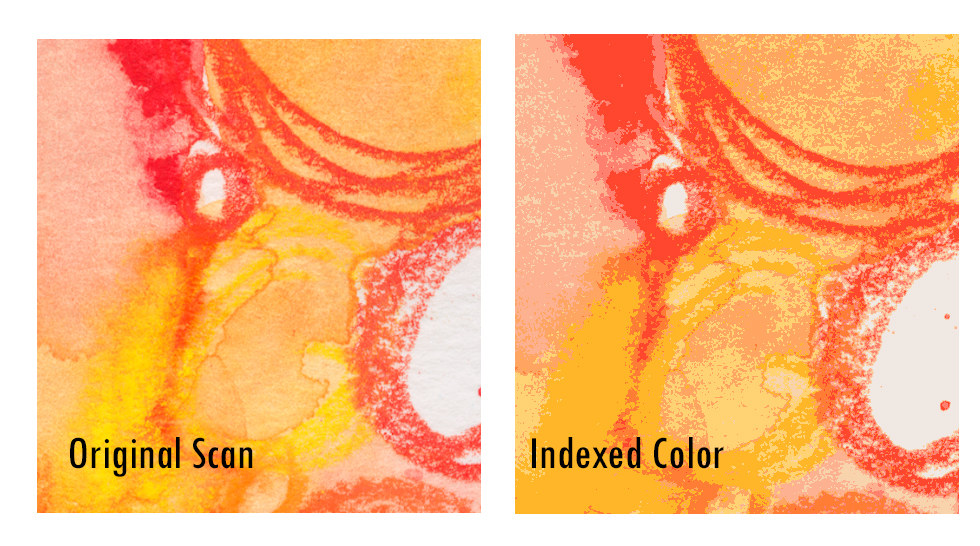
Here’s an example from a colored pencil and watercolor sketch I created and, on the right, reduced to 12 colors.
It could look worse—and if I had indexed a photo—it almost certainly would have been worse. So, what could I have done to help this?
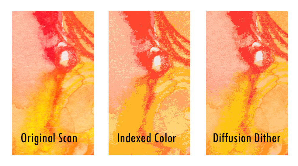
The easiest first step is to add dither. Dithering is a way to make one color look as if it is blending into another by scattering pixels of one color onto the other. Even though the colors look blended, they aren’t. I have been a knitter, a beader, and a stitcher for much of my life. These are mediums where you use distinct colors and you don’t have the option of many colors to fade, for example from red to yellow.
If I were to use a Photoshop gradient, I could make a smooth gradient between red and yellow that would have a lot of intermediate colors. In beads or yarn, I can’t do that and to mix red gradually into yellow, I would need to either add the second color as a pattern or a random type mix until gradually, I was using more red and less yellow, and finally all red. You can see the Photoshop dither methods below and they approximate what I would need to do in yarn or beads.
The same process happens when you create indexed color from a limited number of colors. However, if you’re separating for screen printing, too much dithering makes the screen hard to cut. You can see that Diffusion dithering provides the smoothest transition of the three methods. But, at most, you only want to add a diffusion dither of 45%. Let’s see if diffusion dithering helps my watercolor.
That makes a big difference! But, is it good enough? I don’t think so. If you look carefully at my original, you’ll see some bright yellow that’s totally missing from the other two images. So, how do I get Photoshop to choose only the colors that I want it to pick? To learn this process, with lots more visuals and a downloadable file, join us in The Textile Design Lab.


