*images via vogue.com, Marcio Madeira/firstVIEW
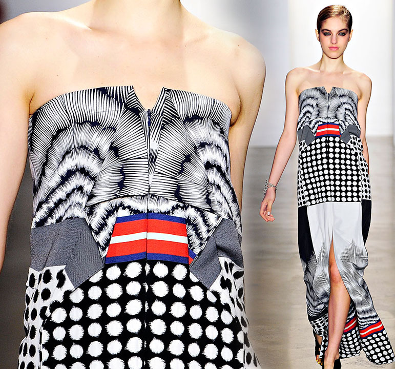
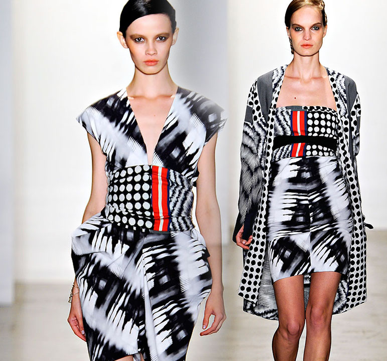
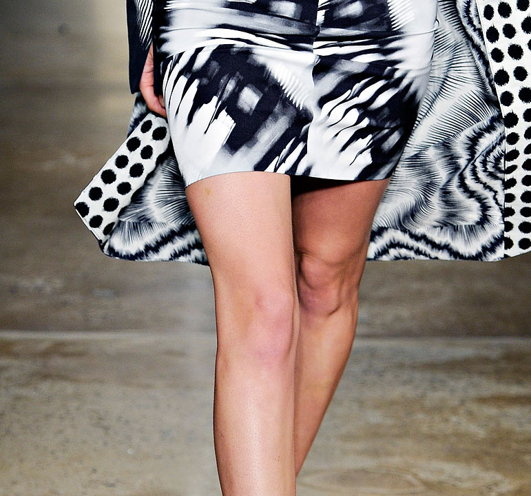
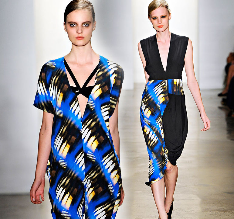
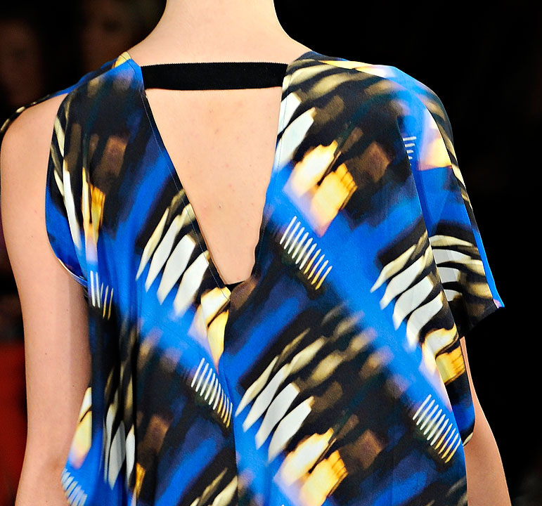
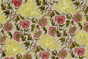
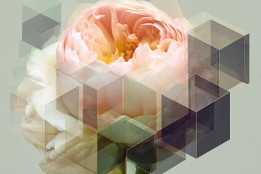
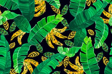
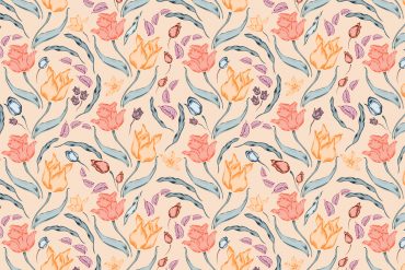
This Spring collection from Zero + Maria Cornejo really caught my eye. Each print is layered with detail and interest, and really just jaw-droppingly gorgeous. I have always felt that interesting prints are born when two contrasting elements or influences are brought together. For example, the blue textural print that you see above: at first glance you simply see a textural ethnic-inspired print, but a moment later it looks like city street lights passing you by in a blur. Another example can be seen in the polka dot. Nothing is more classic and clean than the polka dot, but when given a slight texture the dot is softened and made more wearable. The next time your print or print collection is stuck in a rut, think of adding a dash of contrast. You may even surprise yourself with what you can develop!
-Michelle


