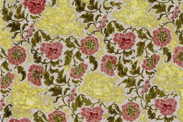
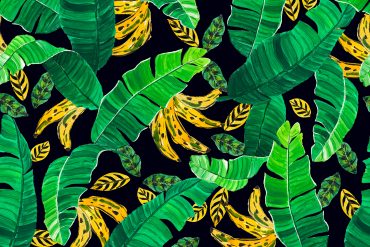
* images via: Alexander McQueen Pre-Fall 2013, vogue.com
The life cycle of a print has many stages: trend research, concept development, artwork creation, tweaking, adjusting, coloring, finalizing and putting into repeat. This last step, the repeat process, is often the step that is overlooked or rushed through, although it is one of the most important parts of the design process.
As designers, we spend countless hours developing the right concept, the perfect flower, or the draw-dropping texture, only to rush through the one step that can make or break a print: the repeat. We are so enamored with the elements, or so excited to move onto the next concept, that we forget that our job is not yet done.
We forget to cultivate the beauty of the repeat.
We forget that a repeat is more than a production tool.
We forget that an uninspired repeat can make the most beautifully illustrated flower look unprofessional and lackluster.
In today’s competitive design market, developing thoughtful repeats is one of the easiest (and least expensive!) ways to take your business to the next level. So instead of treating your next repeat as an afterthought, take a deep breath, enjoy the process and see how you can improve your artwork through your repeat. Here are three tips to help get you started:
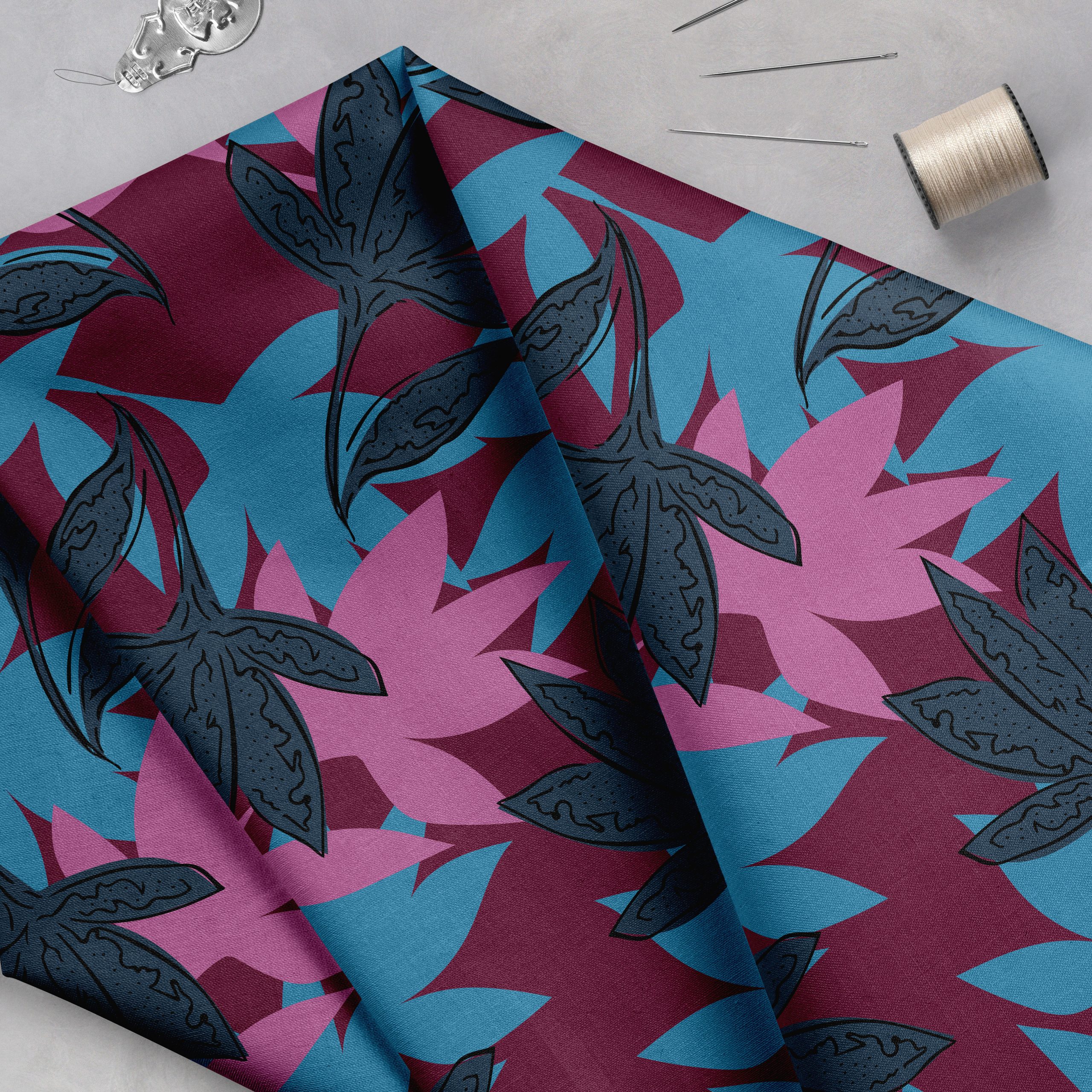
1. Create multiple elements. If your elements are irregular or hand-drawn, consider drawing more than one version to give the print variety. Many designers illustrate one element, such as a flower or bird, and then copy and paste it until the page is filled. Instead, try creating a second or third flower with a similar look and feel, but with slightly unique elements. One flower petal could be folded ever so gently or one leaf could be blowing in the breeze. These details will give your print a much more professional feel.
2. Flip and rotate. If you don’t have the patience for tip #1, then try flipping, rotating or scaling your main element as you duplicate it within your layout. This will add variety to your print and will help to avoid any unintentional directionality that may be created by your elements. For example, if you have a leaf that is slightly tilted to the right and you use this leaf throughout your print, your entire print is going to feel like it is slightly tilted to the right. By flipping and rotating this leaf you will give the print a more balanced, even feel.
3. Think bigger. One of the most frequent mistakes that many designers make is creating a repeat that is too small. I understand that creating a layout is time consuming, but drawing a four inch square of artwork and then using Illustrator’s pattern tool is not always the right solution. Unless you are developing a very small scale print, I encourage you to create at least 32 cm (12.5”) of artwork.
I’m celebrating the power of repeats in my five week group study course: The Ultimate Guide to Repeats. The course is filled to the brim with fantastic tutorials which will take your patterns from lackluster to razzle-dazzle. This course is now a part of our Textile Design Lab e-learning community. Learn more here…
Lots of love –Michelle

