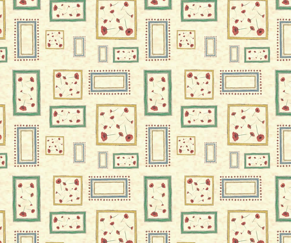
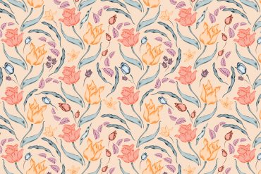
Each month in The Textile Design Lab we share a pattern design tutorial to introduce new techniques and concepts and help give our students an edge in this industry. In the full tutorial available to Lab members, Julie Gibbons walks you through her process of creating a Bloomsbury style pattern, starting from hand-painted motifs and ending with the beautiful pattern seen above. Enjoy this free excerpt and join us to access the full post!
I have come to love Bloomsbury style, for its painterly warmth and expressiveness. It is gently exuberant, with lovely loose, flowing brushstrokes and warm colours and textures.
The Bloomsbury Group was a loose-knit collective of writers, philosophers and artists operating from London in the early part of the 20th century. Their most notable collaborative work was a farmhouse called Charleston in East Sussex, which they decorated with many of their own artworks, including frescoes, mosaics, ceramics and later, fabrics.
As a collective, they were a a hotbed of enthusiasm soaking up myriad ideas and styles, and great discussions sparked new ideas and new directions. They were especially fond of the colour and liveliness of recent movements in painting – post-impressionism, fauvism and cubism – and they mixed it up with classic ornamental patterns from around the world.
The resulting style was spirited and joyful, with colour and pattern on almost every available surface. That might sound incredibly busy, gaudy even, but there were several elements that were repeated throughout the house and garden that tied the whole together and made it a warm, inviting, and vibrant place to be.
Stylistic elements
Borders of simple graphic elements (stripes, spots, cross-hatching, etc) were used to frame architectural features – windows, doors, cupboards, and mantelpieces. Many of the patterns were given high definition through the use of outline. These painted frames often then became canvases for figurative works, including bowls of fruit and flowers, nudes, portraits and acrobats, fish and fountains. They used a palette of subdued brights; warm hues of reds and yellows predominated, with clearer blues as contrast.
Pulling it apart
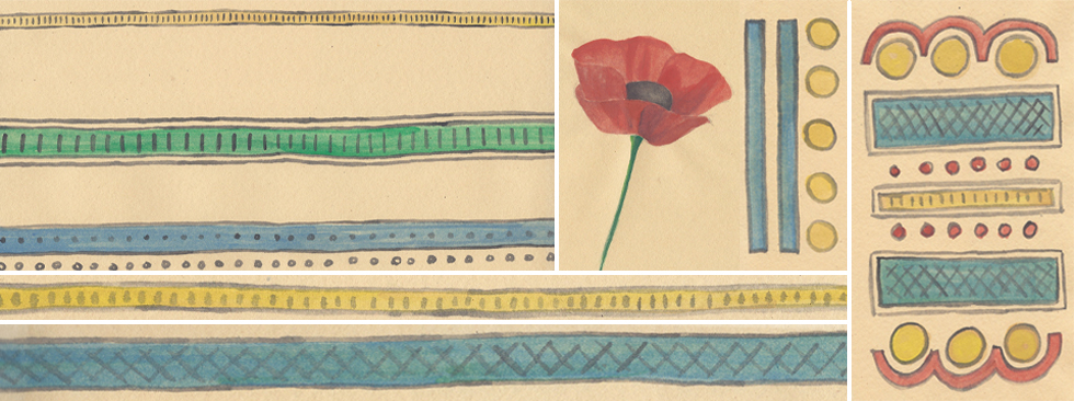
I love all the hand-painted elements of the borders and frames, so I started by painting several variations of stripes, spots and circles in watercolour on pale brown paper. And, inspired by the many paintings of poppies throughout the farmhouse, I also painted several variations of this luscious red flower.
Putting it together
Join The Textile Design Lab to see how Julie transformed these design elements into a finished pattern!


