Last week’s post shared why forecasting design trends is so important to our work, as well as a few ways that you can begin dipping your toes into trend forecasting market. Today I’m going to share an example with you about how to bring design trends to life by applying your own artistic style, while also taking into account the wants and needs of the end consumer.
Identifying Design Trends
In this example I will be using one of our favorite design trends that we call “Layer Play.” Layer Play is a trend that has been around for a few seasons and shows no signs of going away anytime soon. It explores opacities, overlays, and layers. I first noticed this “Layer Play” trend while exploring our Pinterest Board and found supporting imagery in WGSN’s reports. It’s exciting to have a trend that can be interpreted in many different ways and applied to a variety of customers. This is why all of us at Pattern Observer Studio are drawn to “Layer Play.”
Here are two directions we see this trend going:
Option #1: Soft Layers
In this first option we see the trend going in a more abstract manner. It’s all about softness and movement, abstract textures and oversized motifs.
Option #2: Bold Stripes
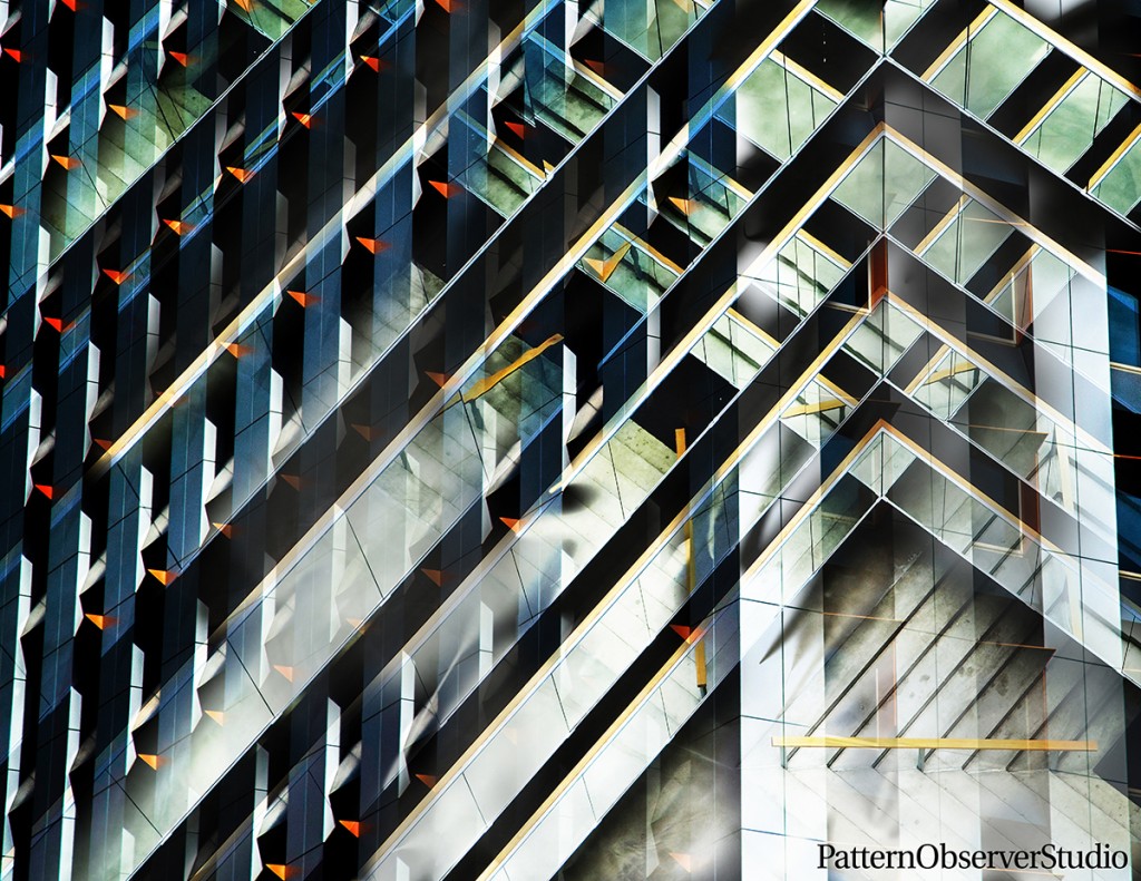
In this second option we show how this trend can be taken in a bolder, graphic direction. Stripes, plaids, and geometrics can be layered or woven to create more sophisticated designs.
Interpreting Design Trends
So we’ve identified a trend and created the trend boards. What comes next?
The next step is to figure out how to interpret this trend in your artistic style and in a way that will resonate with your customer. Most of our studio clients and buyers are in the activewear market, which is why I chose this market. However, it is not the only market. The sky’s the limit! This trend could have been applied to men’s fashion, home, childrens, etc. The list goes on and on…
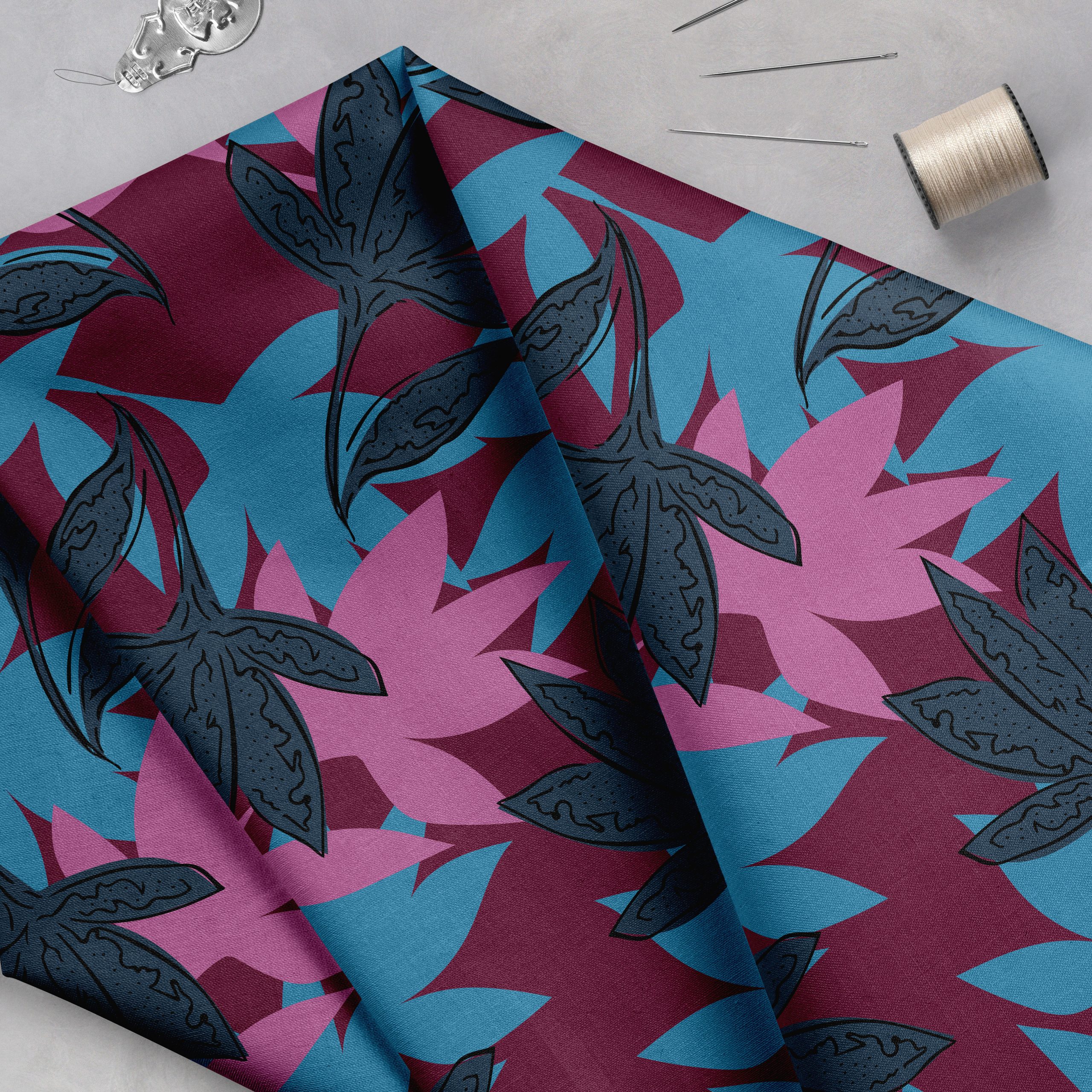
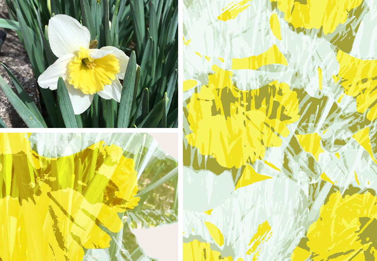
Start the design process by looking through your own photographs or sketches for inspiration. That’s what I did and it was very helpful. I found this daffodil picture that I had taken while Ruth and I were playing in the backyard. I wanted to develop something large scale and dramatic, so I enlarged the image and began playing with various overlays and filters.
Adapting The Design Trend
I really liked the look that I created in the bottom left concept, but felt it was a little too elegant for the activewear market. I decided to correct that by simplifying the amount of colors to make it bolder and more abstract. The final result retained the essence of the layered trend, while being updated and better suited for my customers.
Creative experiences like this are a part of what makes it so fun to work with trends. They are a great starting point, and when we get to interpret them in a way that makes the most sense for our artistic style and our customer’s brand, we are able to shine.
