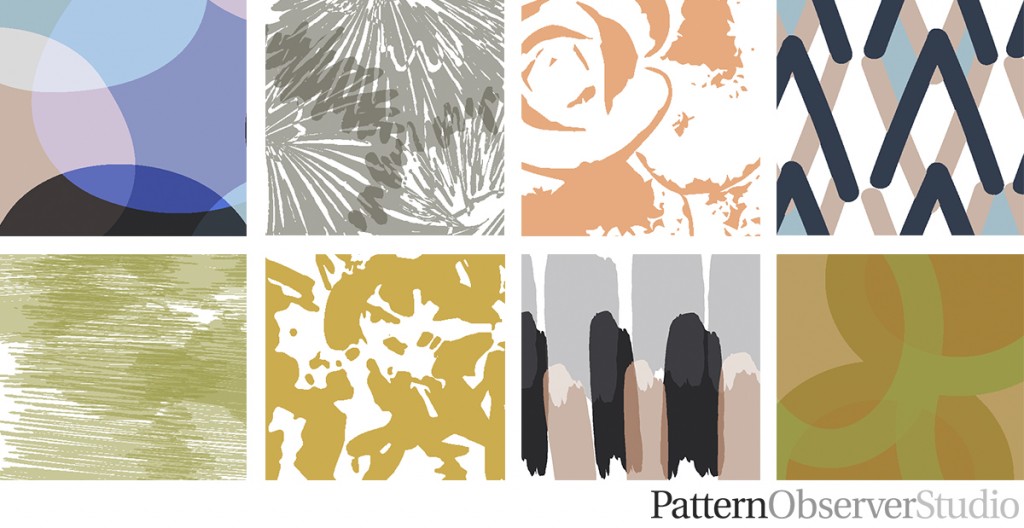
I’m disorganized, and it’s part of my personality that I have learned to embrace. There’s something about the chaos that fuels my creativity. But when it came time to create a portfolio for our Pattern Observer Studio launch, I even needed a system. With three designers’ work to present, I needed a method to organize the creative chaos into something impactful.
Portfolio development is about more than compiling your best pieces. It’s a strategic process requiring careful curation, organization, and presentation. Whether you’re a student showing academic growth or a professional highlighting accomplishments, a strong portfolio can create opportunities.
Table Of Contents:
- The Challenges of Portfolio Development
- Finding a Solution: The Digital “Floor”
- The Benefits of Strategic Portfolio Development
- Portfolio Development Across Different Fields
- Best Practices for Portfolio Development
- Tools for Portfolio Development
- Overcoming Portfolio Development Challenges
- Conclusion
The Challenges of Portfolio Development
As I looked at the digital files, I felt overwhelmed. How could I sort through all these patterns and create a portfolio representing our studio’s capabilities? The task seemed massive:
- Organizing patterns into cohesive collections.
- Categorizing by style (stripes, florals, etc.).
- Identifying trend-driven designs.
- Highlighting timeless classics.
It was enough to make anyone stressed. It felt like trying to tame a tornado even for someone who thrives in creative chaos. As designers, we love to create new prints and patterns, and knowing which to put in your portfolio can feel daunting.
Finding a Solution: The Digital “Floor”
My first thought was to print everything and spread it on the floor. Old school, but effective? Not really. It was wasteful, expensive, and risked my daughter’s little hands or my dog’s little paws rearranging my designs.
Then inspiration struck. I decided to create a digital “floor” using Photoshop. This virtual canvas became essential to portfolio development.
How the Digital Floor Works
Here’s how I transformed portfolio development with this digital solution:
- Create a large Photoshop artboard.
- Add screenshots of all patterns and concepts.
- Group similar designs into collections.
- Identify gaps in the portfolio.
- Spot missing trend pieces.
- Recognize underrepresented classic styles.
This let me see our entire body of work at once. This process makes it easy to spot patterns and make strategic portfolio decisions.
The Benefits of Strategic Portfolio Development
Thoughtful portfolio development has significant benefits. As one student noted, “Michelle, your course timing is perfect. I’ve been struggling with portfolio development, so I’m excited for this.”
A well-curated portfolio has advantages.
- Showcases your best work cohesively.
- Demonstrates growth and skill development.
- Tells your story and the story of your artistic journey.
- Creates a tool for job searching.
- Builds confidence in your abilities.
Portfolio Development Across Different Fields
My experience is in textile design, but portfolio development is crucial across professions. Researching your specific industry and how best to present yourself is a good idea. Let’s see how different fields approach this process:
Students
For students, portfolio development is ongoing throughout their academic journey. It’s about showcasing projects and demonstrating growth and student learning. You need to use your class time efficiently to get the best examples of your work into the portfolio.
Burman University provides student resources for building portfolios. They highlight including various materials:
- Course projects.
- Research papers.
- Internship experiences.
- Extracurricular projects.
Professionals
For professional designers, portfolio development highlights career achievements and expertise. It demonstrates value to potential employers or clients. You need to tailor your portfolio to the people you’re sharing it with, and remember that good examples can have a major impact on a hiring team.
Lisa Rivas shared her excitement: “This is perfect, Michelle. I have designs scattered everywhere. I’m looking forward to this class and launching my Surface Design website after organizing my work.”
Professional portfolios might include:
- Case studies of successful projects.
- Client testimonials.
- Awards and recognitions.
- Published works or presentations.
A designer should show how pieces demonstrate a consistent approach and design philosophy when presenting graphic, surface pattern, or textile design work.
Best Practices for Portfolio Development
Regardless of your field, some best practices apply to portfolio development.
1. Know Your Audience
Tailor your portfolio to your audience. An employer might look for different things than a creative, freelance client. You must also consider your portfolio requirements for graduate school if that’s where you intend to go. Consider whether your work will be shared digitally or in print. These aspects change how your pieces are viewed, ensure consistency across each platform, and use each for its strength. Remember, a mentor or online community can also advise you on how your pieces should be best displayed and presented.
2. Quality Over Quantity
Choose your best work, not everything you’ve created. Select pieces that represent your skills and style. Don’t throw everything in your portfolio; instead, include your favorite designs and most accomplished works. If you need to show range, ensure the pieces you show represent your style and the type of work you would like to create in the future. This demonstrates the care and skill that produced the best final results.
3. Tell a Story
Your portfolio should narrate your professional journey. Organize your work to show growth. Use it to showcase how your skills have developed, from your earliest attempts in class time to the current polished works you have produced.
4. Keep It Updated
Regularly review and update your portfolio. Include your latest and best work. Update and check the status of the portfolio regularly, not just once every five years when you are applying for a new job or seeking new freelance clients.
5. Make It Accessible
An online portfolio is essential today. Platforms like Behance, Dribbble, or a website make your work accessible. Always make sure there is an email address or “Contact Me” page on the portfolio website so that interested viewers can contact you about opportunities.
Tools for Portfolio Development
I used Photoshop, but many tools exist for portfolio development. Some portfolios require student work from a wide range of areas. Use this comparison to decide what tool best fits your graphic design and portfolio requirements:
| Tool | Best For | Key Features |
|---|---|---|
| Adobe Portfolio | Creatives | Integrates with Behance, customizable layouts. |
| Squarespace | All-purpose | Beautiful templates, e-commerce capabilities. |
| WordPress | Versatile | Highly customizable, great for blogs. |
| Wix | Beginners | Drag-and-drop interface, wide range of templates. |
Overcoming Portfolio Development Challenges
Portfolio development has challenges. You may not have the appropriate equipment, time, or programs to do everything required to create the quality and breadth of your ideal portfolio. Some challenges that we see designers facing include:
1. Feeling Overwhelmed
You might feel overwhelmed by the amount of work. Break the task into smaller chunks. Set aside time each day or week to work on your portfolio.
2. Lack of Confidence
It’s easy to criticize your work. Seek feedback from peers or mentors in an online community such as the Textile Design Lab. Your portfolio should show growth, not perfection.
3. Keeping It Current
Set reminders to update your portfolio. This could be quarterly, bi-annually, or after each major project. When designers are first getting started, their work usually develops at a rapid rate, with different focuses week by week, so make sure to keep your portfolio and social media platforms updated.
4. Technical Challenges
Creating an online portfolio can be daunting if you aren’t tech-savvy. Seek help or take online courses. Many platforms or communities offer tutorials and support.
Elevate Your Portfolio and Your Career
In the Textile Design Lab, we provide the tools and guidance you need to create a portfolio that stands out and aligns with your career goals.
✨ Three dynamic tracks to help you thrive:
🎨 Print on Demand Business – Master digital platforms to sell your designs.
💼 Freelance Business – Learn how to attract clients and manage projects successfully.
🤝 Selling through Agents or Studios – Navigate the industry and connect with exciting opportunities.
Whether you’re refining your portfolio or building it from scratch, our resources and expert guidance will help you showcase your work and achieve your creative dreams.


