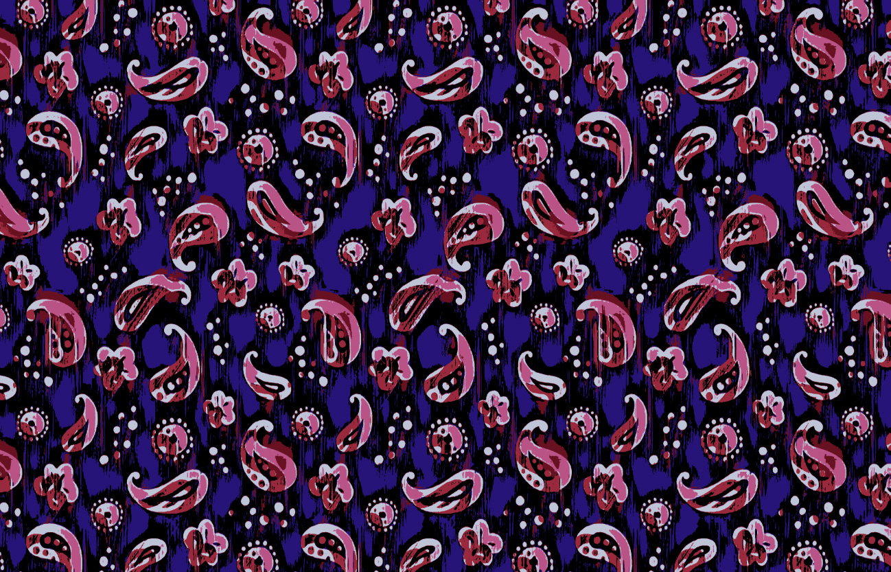
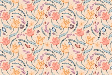
You toss a handful of autumn leaves up into the air, watching them fall to the ground. They land in a scattered pattern. Some facing up; some facing down. Some turned to the left; others to the right. This is a tossed surface pattern design layout.
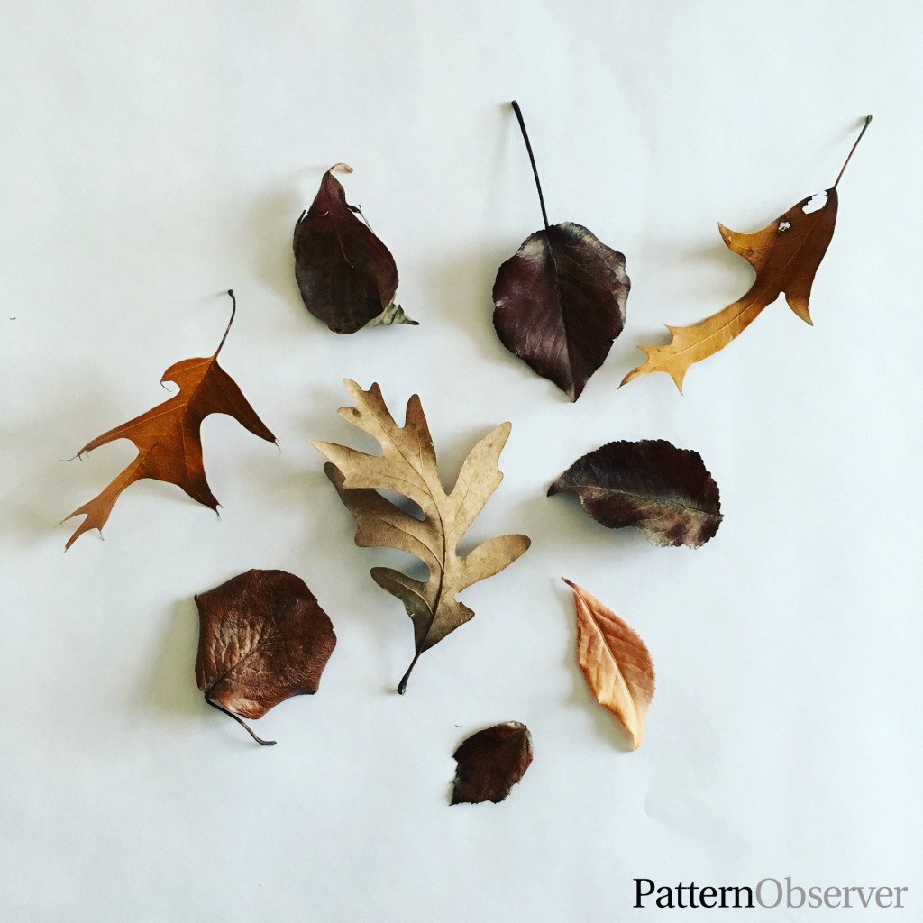
A tossed surface pattern design is defined as: a layout in which the motifs are arranged in a scattered, but balanced way. This is one of the most popular layouts in our industry. And it’s the layout style that most designers create when they start designing patterns.
When you’re new to pattern design it’s best to keep your tossed layout simple. Sketch an interesting motif, bring it into Adobe Illustrator or Photoshop (affiliate link), and then copy and paste the motif repeatedly until you fill your art board with your newly created pattern. While doing this, remember to:
- Flip and rotate your motifs so they are not all facing the same direction, as this will give the illusion of randomness, despite you being intentional.
- Avoid arranging your motifs into unintentional lines or stripes. Try to stagger the placement of your motifs.
- Keep the spacing between the motifs balanced and equidistant.
Repeating a solitary motif has its place in our industry and can be absolutely perfect in its simplistic loveliness, but after mastering this process, you’ll likely want to go beyond repeating a single motif and begin creating patterns that are a bit more eye-catching. It’s a great way to garner the attention of buyers.
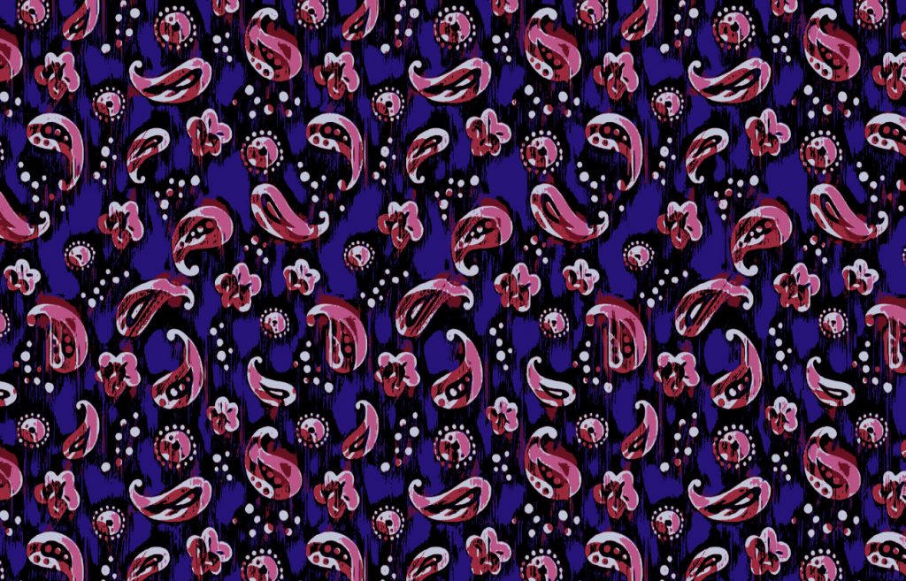
When you feel ready to up your game, here are a few simple ways to a more creating eye-catching tossed layout:
1. Use more than one motif.
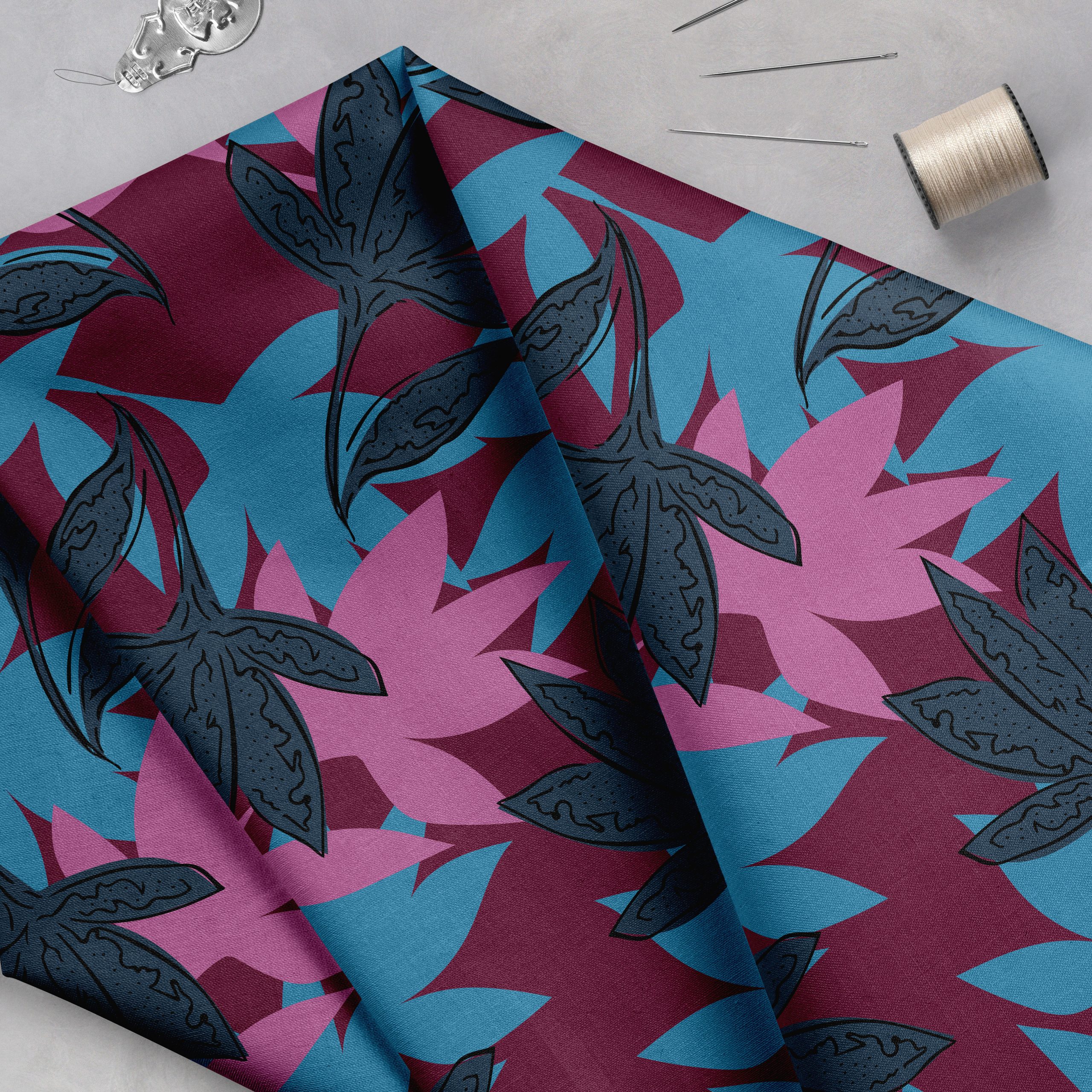
Try creating your tossed layout using two or three different motifs at different sizes. Not sure what additional motifs to use? Put yourself into the story of your design. What other objects might surround your motif in a natural setting? For example, let’s say you drew a flower. What other motifs might be found around your flower? Some ideas include leaves, animals, raindrops, petals, etc.
2. Try playing with color “pops” sprinkled throughout your layout.
A color pop is a quick way to jazz up a flat pattern. Just be sure to use your color pops in a balanced way. For example, you don’t want all your color pops to be clustered in the bottom right corner of your layout.
3. Try adding a background pattern.
I find that using a dramatically different sized pattern in the background adds interest to the design, without it becoming too busy or overwhelming. Try using a very small scale pattern or an oversized two-color shadow pattern in the background.
Save

