One of the best ways to grow as a designer is to continually sketch, experiment with new design processes, and have fun with your work. Finalized patterns are beautiful, but a designer’s process and creative journey is what I find to be truly inspirational. Being able to take a peek into a designer’s sketchbook, or getting a glimpse into an artist’s studio or process, is magical. Luckily for me, many talented designers shared these visual gems with us last week. Here are some of my favorite sketchbook and process shots from our #patternobserver Instagram feed.
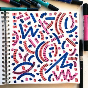
This sketchbook shot from Julz Nally caught my eye immediately. The bright and bold background motifs really grab your attention, but the detailed linework adds a really nice playful touch to the design. If you check out Julz’s Instagram feed you will see that she has a knack for these really bold, colorful patterns, which she creates with Prismacolor markers. I haven’t used Prismacolor markers since college and I think it might be time to grab a couple and start playing!
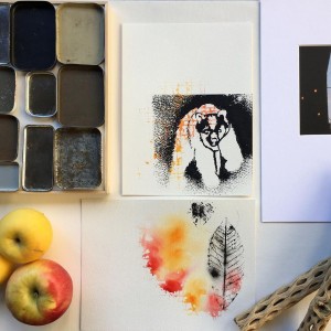
Take a look at this shot from Tania Rodamilan, a jewelry designer and maker out of Chicago, Il.. Similarly to Julz’s work, Tania has used bright colors in the background with black and linework, and texture in the foreground. I love the contrast between these two pieces she has highlighted. The bear is bold, textural, and heavy, while the black leaf is wonderfully delicate and seems light as a feather. If you have been feeling a little stuck in your design process, playing with stamps and layering of motifs and textures might be a fun technique to try.
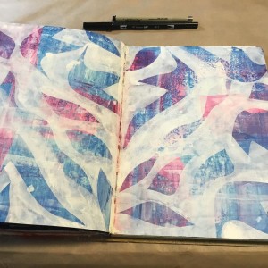
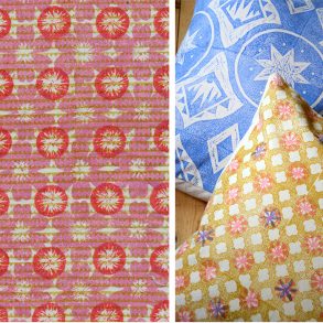
Speaking of layers and textures, I am smitten with this completely gorgeous pattern by Cathy Cosgrove. Cathy shared that it was created “…using an original deli paper stencil and acrylic paint with water. I scraped the paint on to the journal using a credit card and let it dry. Then I applied white paint over the stencil with a sponge to achieve the hard edges.” The movement of the motifs and the layout are a perfect complement to the layers upon layers of colors that were created using this unique technique. As Cathy states in her bio: “I experience art as play. If it’s not a whole lot of fun, I won’t do it!” I believe this wonderful philosophy really comes through in her unique work.
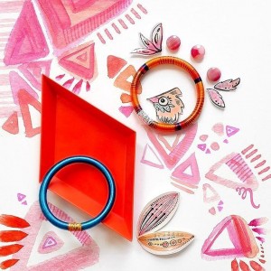
This idea of play and experimentation continues into this piece by Katrin Meiller. Katrin consistently shares images of her beautiful sketches, painting experiments, and inspirational finds with her Instagram followers. I love the way that she thinks about her work and sees the big picture of her brand. She seems to be constantly exploring what the Katrin Meiller brand represents and it is a wonderful journey to watch.
Last but not least, we have this lovely sketchbook shot from Tonia Dee. I found this piece in our #patternobservershakeup feed, which is a part of our 5-day Design Shake-up Challenge. I was really drawn to the painterly wash in the jug motifs, which are then made stronger by the overlaid details and bolder leaf motifs.
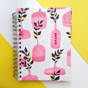
Tonia was inspired to create this pattern after having a conversation with her 3 year old son about how a jug is different than a jar. I love this idea of taking pattern inspiration from a conversation. What conversation have you recently had that might inspire your next pattern?
Without the proper creative explorations our ideas and visions fall flat, and we eventually grow uninspired by our process and final work.


