“What is the color of the year? And what does it mean for me as an artist?” This is what I was asking myself last year and maybe many are asking the same question. I am Nivedita Calla, a surface pattern designer based in India, living with my husband and my small but thriving kitchen garden. With an analytical background in law, I tend to approach my business in the same way. Every year Pantone announces a new color of the year and it goes viral for the next few months. It tends to create a buzz across industries, from Vogue suggesting Top Picks to Spoonflower hosting a design challenge. While all this chatter is nice, it can be overwhelming for a designer and you can find yourself wondering, “But what does it really mean for me and my work?”
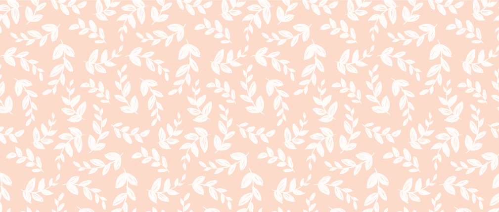
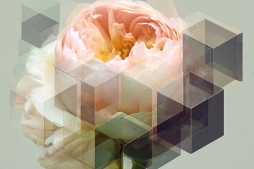
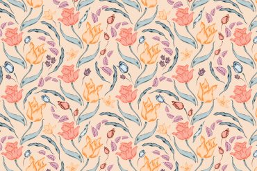
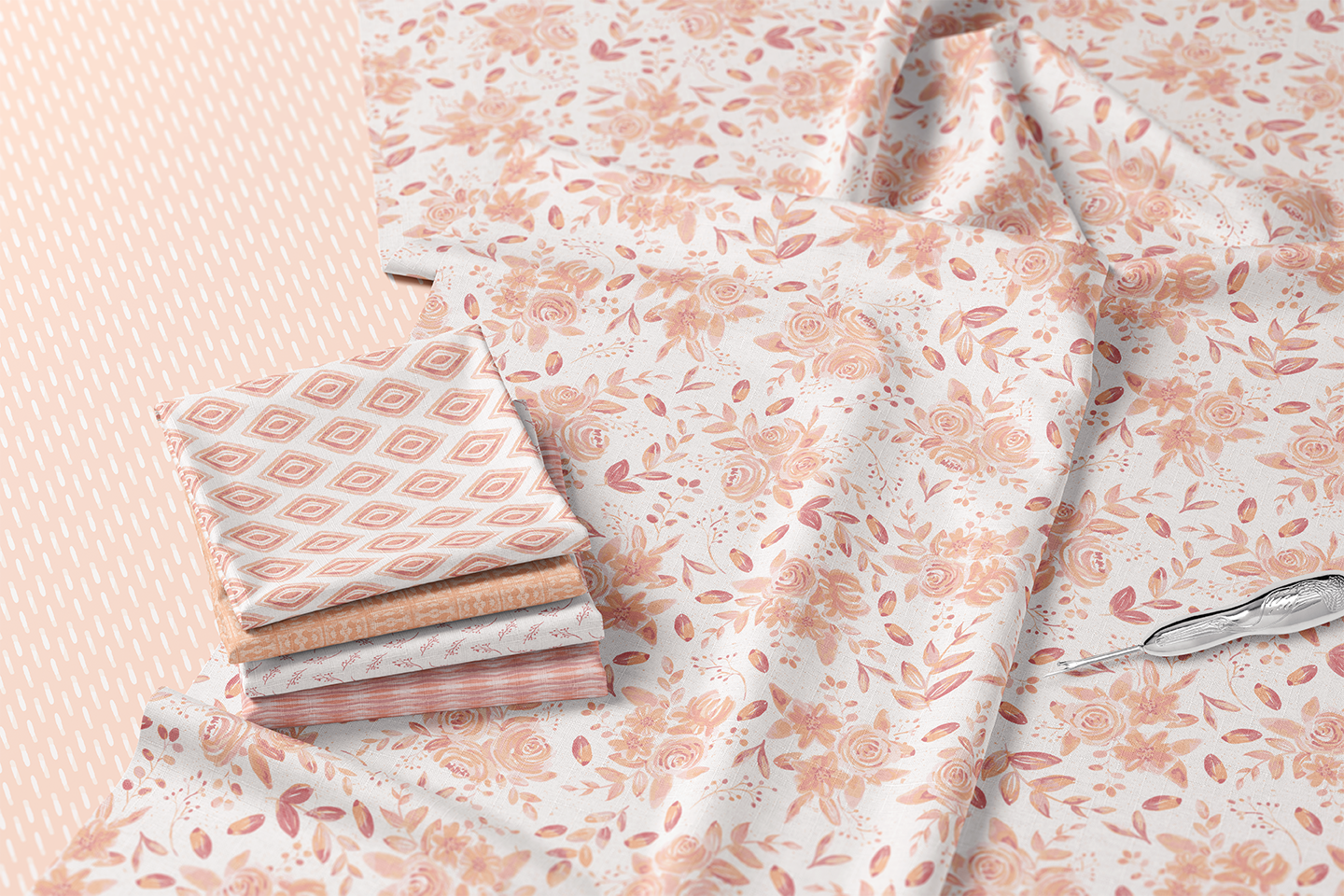
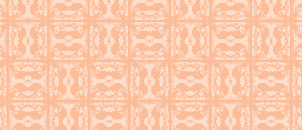
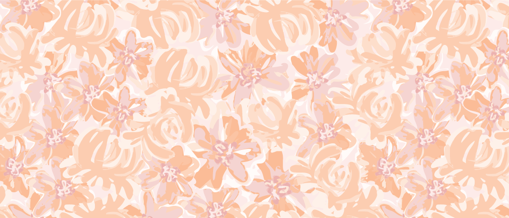
Learning to work with trends effectively and deciphering what they can mean for your art business is a skill that is grossly under-valued. Something I enjoy doing a lot is dissecting the latest trends and what they can mean for my craft. Peach Fuzz, the PANTONE Color of the Year for 2024, got me excited because it’s a color with deep symbolism. This nurturing and heartfelt peach tone represents softness, compassion, and a desire for community and personal well-being. In a world that increasingly values empathy and connection, Peach Fuzz stands out as a color that signifies inner peace and a cultural inclination towards simplicity and togetherness. Understanding the symbolic meaning behind a color can work wonders for designers because we can really take a subjective concept like “comfort” and bring it to life tangibly through our work.
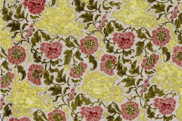
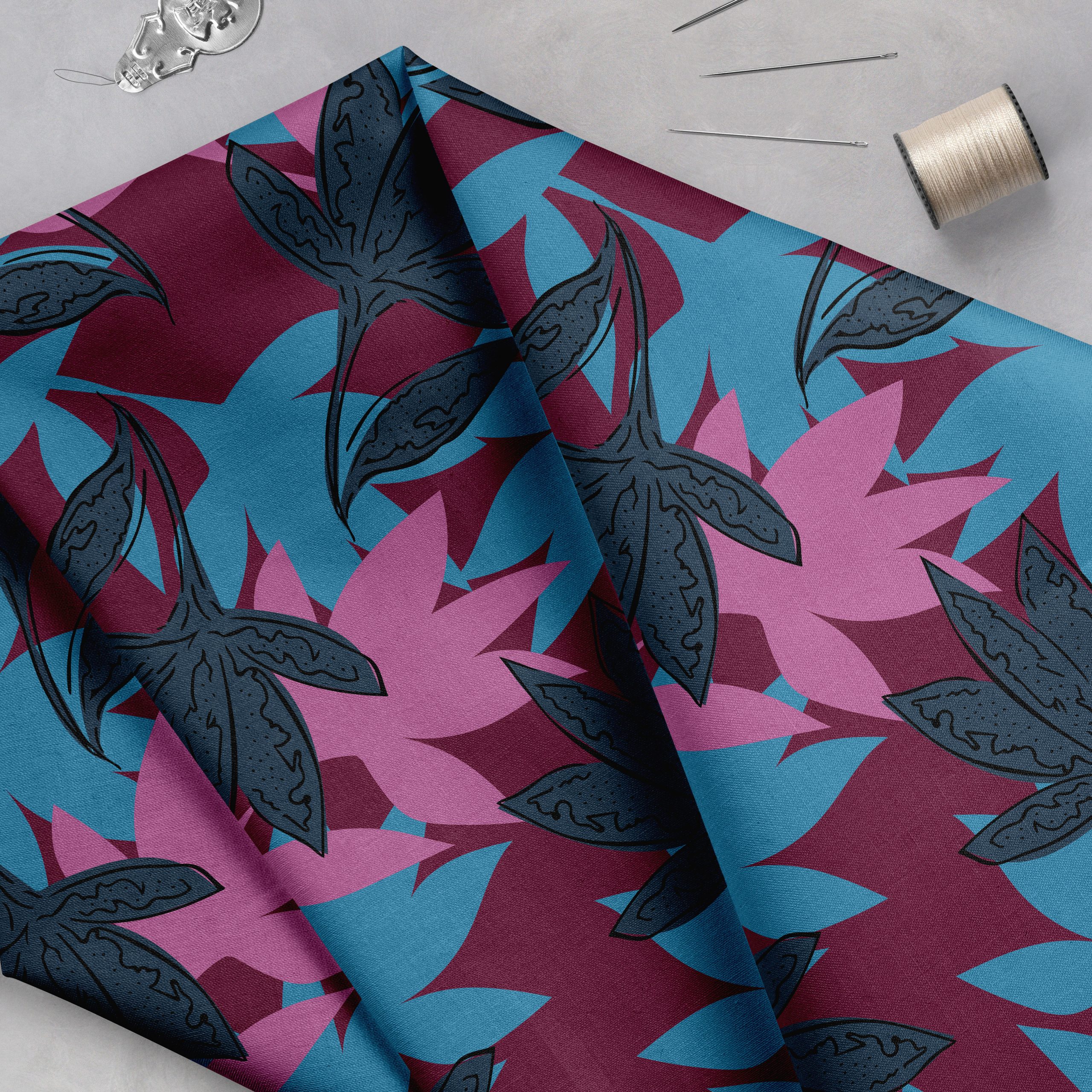
Colors have the power to evoke emotions and convey deeper meanings. I’ve been incorporating Peach Fuzz in my work for feelings of warmth, comfort, and nostalgia. This approach enhances the visual appeal and deepens the connection with my audience, as the color resonates with contemporary cultural sentiments. The word “trending,” is really all about being aware of current cultural sentiments and knowing what will work with consumers. My go-to ways to stay on top of trends is to recolor old artwork to fit this updated aesthetic. Peach Fuzz offers an excellent opportunity for designers to breathe new life into their existing work. By integrating this color into older pieces, artists can update their portfolios to align with current trends. This refresh can transform the artwork, giving it a contemporary edge while retaining its original essence.
Such a color update is an effective way to keep the artwork relevant and engaging in the ever-evolving world of what is trending. For me, I’m looking at Peach Fuzz as more than a color-it’s a reflection of current design ethos and cultural values. For designers and illustrators, it presents an opportunity to infuse these qualities into their work, making their creations not only visually appealing but also emotionally resonant. Embracing the color of the year in your current artwork can lead to innovative and impactful designs that speak directly to the viewer’s heart.
If you wanna hear more from me, find me on Instagram. You can also follow my blog If you enjoyed this, you can grab 3 color palettes (all featuring Peach Fuzz) as a free download.
Thanks for reading, Nivedita Calla