Hello Pattern Observer, I am Lilly Platt-Hepworth, I specialize in print design for fashion textiles and I am happy to share my process of designing floral prints with you! I grew up in a small town in the Blue Mountains west of Sydney, Australia where I formed a strong attachment to the bush and outdoors. I am far younger than my siblings, so the birds and trees were my friends. In 2011 I started my career in graphic design, but spent a lot of my free time drawing the flowers and birds I cherish so much. It wasn’t until I met another textile designer and botanical illustrator in 2017 that I learned I could merge my skills to have a creatively fulfilling career designing prints for textiles. Now every day I get to celebrate my love of nature in my work and if I’ve done a good job, other people might choose to wear that celebration on their bodies or hang it in their living rooms. I reached out to Pattern Observer to share some of my knowledge of designing a successful print.


Finding Movement in Your Floral Design
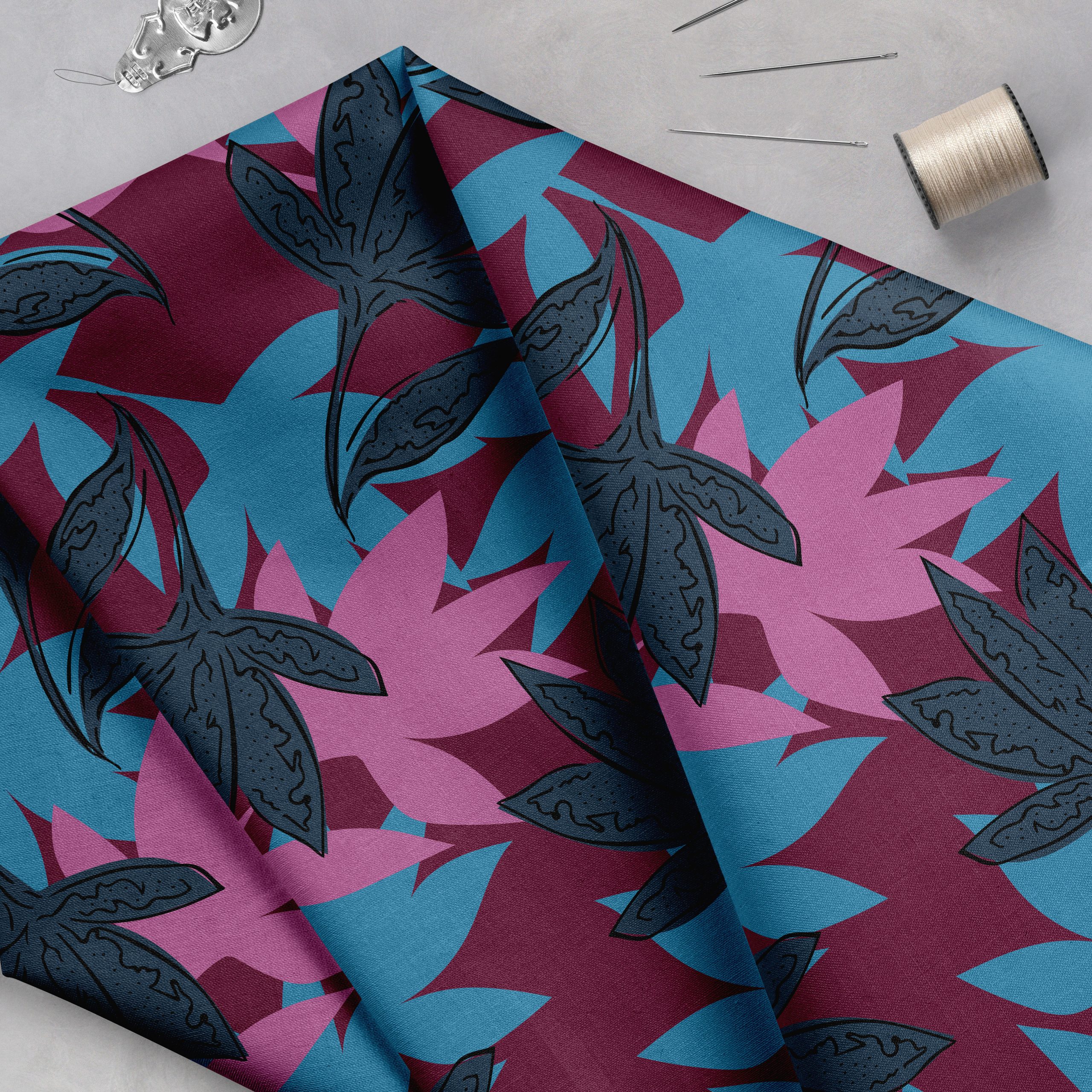
One of the key lessons I’ve learned from designing prints for fashion and homeware textiles is the importance of movement. When I first started, I used to draw everything as I saw it—exactly as it appeared or I would draw a flat front-on version. I had yet to learn, especially when designing floral prints, that incorporating elements with variations in angle, scale, and shape helps create visual interest and prevents the design from looking stagnant. Of course, there are certain kinds of prints where front-facing flat flowers work, such as a classic Liberty floral print. Trend boards often feature flat forward-facing flowers. In the commercial market these sorts of prints, especially ditsies never seem to go out of fashion. But for the drama, interest, and the style of florals I like to draw, it’s all about depth, movement, and flow. That’s what gets me excited about what I do!
Planning your elements and motifs is a crucial step in any design process. Consider what would create good visual balance by deciding on the hierarchy of your visual elements. Pick a hero flower that will draw attention and serve as the focal point and then choose smaller supporting flowers that vary in scale. I like to spend time in the botanical gardens, taking photos of the flowers at different angles so I have a decent library of images to draw flowers from interesting perspectives.

Over time I think you develop an ability to not focus so closely on how the flower actually appears and only use it as a framework on which you can use creative license to adapt. This is where you can have fun accentuating certain areas and making other areas less of a focus. I love to examine the windy and wiggly bits, like vines and unfurling petals, as these can lead the eye through your composition. In the painting/drawing phase of the design, I like to get quite loose. I used to find this very difficult because my perfectionism made me think I needed to get everything exactly right, or as realistic as possible. For print design, nothing needs to be realistic but I think what makes a great design is getting the balance of hinting to the realistic while adding your own little creative twist.
After sketching and cleaning up the scanned elements, it’s all about arranging and refining the elements in Photoshop to create a dynamic composition. Use negative space as an anchor— a skill that improves with practice as you learn to emphasize movement, ultimately making flow and balance second nature in your designs. You might find over time that it becomes a thing you can feel rather than see. Movement in design can be an emotive thing and I think getting used to tapping into this feeling will help develop your skills. Not to mention make designing for print all the more enjoyable!

I often like to put on loud dance music (I know this isn’t for everyone) and get lost in the process. I find that not thinking too much and instead trying to pay attention to your instincts are fun and satisfying things to do. It does mean that the design can take on many iterations and there can be a bit of back and forth (constant changing of my mind) which to an onlooker would look incredibly chaotic! But it can result in a beautifully flowing design with unique character.
I aim to bring out the most visually captivating aspects of nature in my florals, even if it’s a design intended for commercial use. In the end, nature is what caused me to pick up a pencil and draw in the first place so it’s essentially what keeps calling me back to designing print for textiles. I always want to celebrate it!
Another good tip: Before starting your design, find some other designs you like and just look at them for a while. Try and pinpoint what it is that makes that design so visually appealing. Is it movement, is it flower choice, is it the use of negative space? The more you get a handle on what it is that makes a good design the easier you’ll find it to create one yourself. And this just increases over time. Reach out to me with questions! Follow my creative journey on Instagram.
Find even more free design tutorials on the Pattern Observer blog right here!


