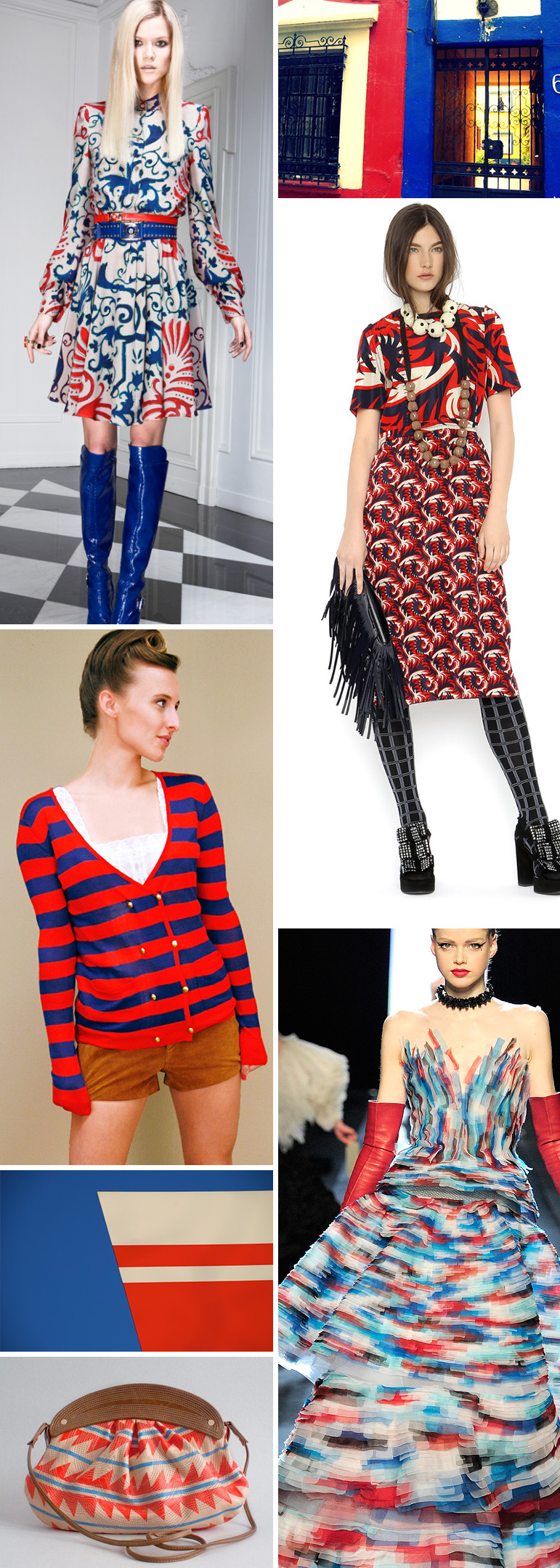
* image credits clockwise: Versace pre-fall ’11 via style.com, Red & Blue #6 by Kudumomo, Marni pre-fall ’11 via vogue, Gaultier Couture spring ’11 via vogue, Sweet Cherry Possum Bag by Missibaba via Aprizi, Reds on Blues #1 by Pierre Bedat, Nautical Cardigan from Shop Cuffs via Aprizi
I am loving the reds, blues, and creams that seem to be popping up all over the place. The use of cream instead of white takes the palette in a less nautical direction and is more wearable for fall, while the brighter(more aqua) blue is a softer approach to the color story. Love it!

