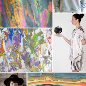
*images via vogue.com, courtesy of Jonathan Saunders
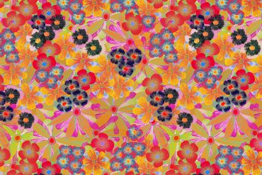
I always feel the need to choose a favorite collection. If you are a long-time reader you know that I frequently say, “I am in love..this is my favorite collection of the season!” One week later, “No wait, THIS is my favorite collection of the season” and so on and so forth. When I looked at this Resort Collection from Jonathan Saunders(one of my favorite designers..wait, I just picked a favorite again..ooops!) I immediately said..”Yup, this is it, this is my favorite collection of the season”, but after much more time than is probably normal for one to spend studying a print collection, I now award this collection with the title: The Smartest Print Collection of the Season.
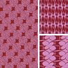
What I love about this collection is that Mr. Saunders, and perhaps an unnamed Textile Designer, took one image and used it across the collection, but with scale, layout, and color changes the pattern looks unique. In some pieces the print is at a fairly normal scale, while in other garments the print is so scaled up that it is almost unrecognizable. The print is colored tonally in some garments and then in others the contrast is so funky that it almost plays with your eyes. Here’s to the power of scale and color usage!