*December Tech Talk by Sherry London. Each month Sherry London brings The Textile Design Lab an in-depth post on how to improve our design process by using technology to its fullest capacity. This is an excerpt of a longer post available to members of The Textile Design Lab. Join us to access the full post!*
“Which color mode should I use when designing?” is a question I have seen over and over recently. I thought that this month, I would try to tackle the issue—and hopefully not make your eyes glaze over in the process!
I love Photoshop and Illustrator and I love designing; but, talking about color modes and how colors are computed is a bit like taking a course on car repair when all you want to do is drive the car! I don’t promise to be able to make this a fascinating blog post, but the information really is important. So, please stick with me.
The two color modes in question are always RGB and CMYK, even though Photoshop can also create grayscale, Lab Color, Indexed, and bitmap images.
The Executive Summary
If all you really want from me is an answer, I can give you a short general rule (but ‘general rules’ always have loopholes, so you still might want to read the article!)
If you will only be using the image for the Web, work in RGB. If you are going to print the image, work in CMYK in Illustrator and RGB in Photoshop.
CMYK and RGB: An Introduction
RGB is the color of physics and of your computer monitors. It is additive color. In this system, red plus green plus blue give you white. This is how your monitor works. If all three elements of a pixel are at their maximum value, you see white. Black is the total absence of color.
CMYK is the color of traditional 4-color process printing. It is, in modified form, the color wheel you learned about in primary school where red plus blue equals purple and you need to mix yellow and blue to get green. This also works in pigments.
If you paint, you will know that if you mix together the closest-to-primary red, blue, and green you can find, will you get black? Not really; you get a dark muddy brown mess.
In printing inks, the blue primary of paint is cyan, the red component is magenta, and the yellow is, well, yellow! Where does the K in the CMYK come from? This is black—a real pigment that is needed to get a true black when you print and to add depth to your colors. Without the black, muddy brown is the best you can do.
CMYK is a subtractive color mode, because white is absence of color—not the sum of all the colors.
Why Does Color Mode Matter?
Color mode matters because another term: gamut. Gamut refers to the number of visible or possible colors in an image. The actual colors in the universe is probably infinite, but your computer can’t produce an infinite number of colors; neither can a printing press.
The computer can produce any color that is a combination of red, blue, and green pixels at an intensity of 0-255 (about 16 million). If you have a better graphics card that can get more intensities of RGB, you can get about 2 billion colors. With today’s technology, that is about the upper limit—and your monitor might not be able to accurately display all the colors that the graphics card can compute.
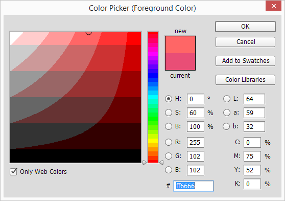
There are about 220 colors that every monitor with any graphics card today display so that the colors look pretty much the same on anyone’s monitor using any browser on Mac or Windows. This is the Web-safe palette popularized by Lynda Weinman (founder of lynda.com.) When the palette was first proposed, it consisted of the common colors that would not dither (that display as a solid color) any of the popular browsers for the graphics cards that could only display 256 colors. We have advanced beyond that today, but if you look in Photoshop’s Color Picker, you will still see an icon if you haven’t used a web-safe color.
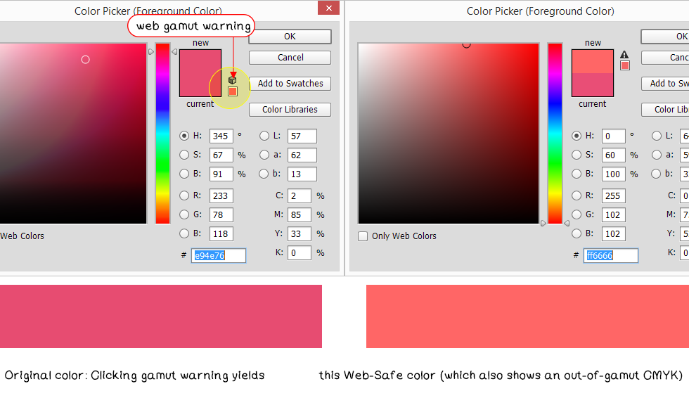
How does this apply to all of RGB or CMYK gamut? It shows you how you can have a smaller gamut from a larger range of color.
If standard “view on all standard monitor” sRGB can display a fixed set of about 16 million colors, what you can get from CMYK?
CMYK is a four-color channel mode with values of 0-100 per channel. In theory that would give you a maximum of 100,000,000 colors but it won’t. You can’t print more than an ink limit of 300 (not 400) or the paper would not dry and the print house would be really upset with you. So, a more accurate number would be 100 cubed (10,000,000). So, even at this starting point, you can only get fewer colors in CMYK than you can in RGB.
The color warning example above also shows you another feature of gamut. My original watermelon color was printable in CMYK but was out-of-gamut for Web-Safe. However, the web safe color was then out-of-gamut in CMYK. So, just because the web safe palette has fewer colors than does CMYK and CMYK is smaller than RGB, it doesn’t follow that all of the colors in the smallest color gamut also are in the larger one.
Some colors can’t appear on the screen or in CMYK print—all of your metallic silvers and golds are a good example of this. They can be approximated, but because these are reflective colors, you can’t get a single solid color that is exact.
However, a huge number of lovely, bright, vibrant colors that you see on screen (in fact, most of them) are impossible to reproduce in CMYK.
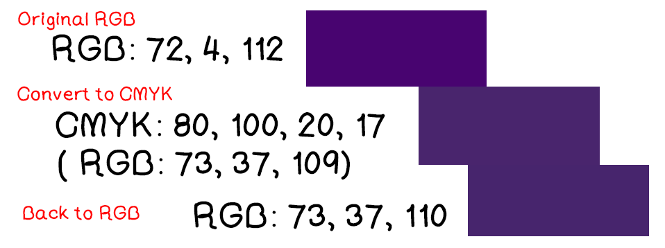
In the image that follows, you can see what happens to two bright images when converted to CMYK mode.
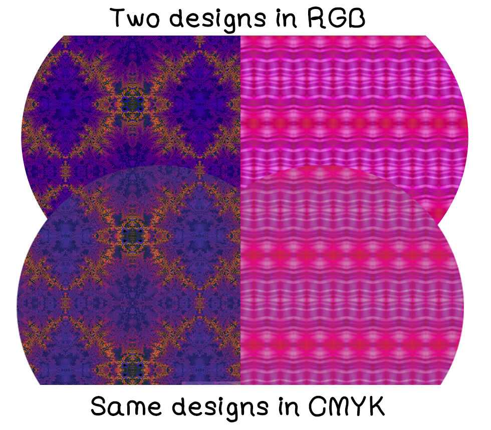
What happens if you convert to CMYK and then convert back to RGB? The vibrant color you lost is lost. The color numbers will change slightly as you convert back and forth, but the color never comes back to the original.
You should be able to see a huge color difference between the top sample and the middle one. However, there is another factor that enters into viewing colors—the monitor you are using. I won’t get into color calibration now but on my second monitor, which is not calibrated, the three image swatches are so dark that they almost look black—and they are too dark to see a color difference.
If you want accurate color, you must calibrate your monitor! (That will be another post!)
Tip: One practical thing that you do need to know: if you want to convert an RGB document to CMYK, you get a more accurate conversion from the Edit>Convert to Profile command in Photoshop than you do from the Image> Mode>CYMK command. Please do remember that tip!
In the full post in The Textile Design Lab Sherry goes into detail on color profiles, the specifics of working with CMYK and RGB in Illustrator and Photoshop, how to preview or “soft-proof” your work, and also provides some web references for further learning on this topic.


