Series on the history of surface design by Julie Gibbons. Part 1 in the Russian Folk series here, Part 2 here.
When I first started investigating the various styles of Russian folk and decided to split them over a few posts, I paired them simply according to stylistic similarities – but interestingly, it seems they are paired according to location as well. Gzhel style and Zhostovo style are both from the Moscow region – from the east and north of Moscow, respectively.
Of course it seems obvious that when these styles appeared (both around the early 19th Century) that trade from nearby areas would bring them into contact with each other and hence the swapping of ideas and techniques. But it also makes me curious about our current global culture which is fed by media and the internet, and how it has meant that in many ways, regional flavours are diminished. Food for thought!
Anyway, for these styles there are two things that really tie them together. Overwhelmingly, flowers form the central decorative motif for both styles, and for both there is also a strong, consistent use of tonal gradation to produce a sense of three-dimensionality. But there are several differences too – colour being the most obvious one.
Gzhel is traditionally used on ceramics, using a combination of cobalt blue on a background of white (similar to Delft, which I might get to in a later post too). While flowers form the majority of the motifs used, occasionally there are animals, architecture and genre scenes. The flower forms used in Gzhel-ware are a little more stylised than that of Zhostovo, and sprays of similarly stylised leaves break up the clusters of flowers. Symmetry of the overall design is also more common. Abstract and sometimes complex patterns form borders on objects, but these can also be interspersed with flowers to form alternating panels over the whole object.
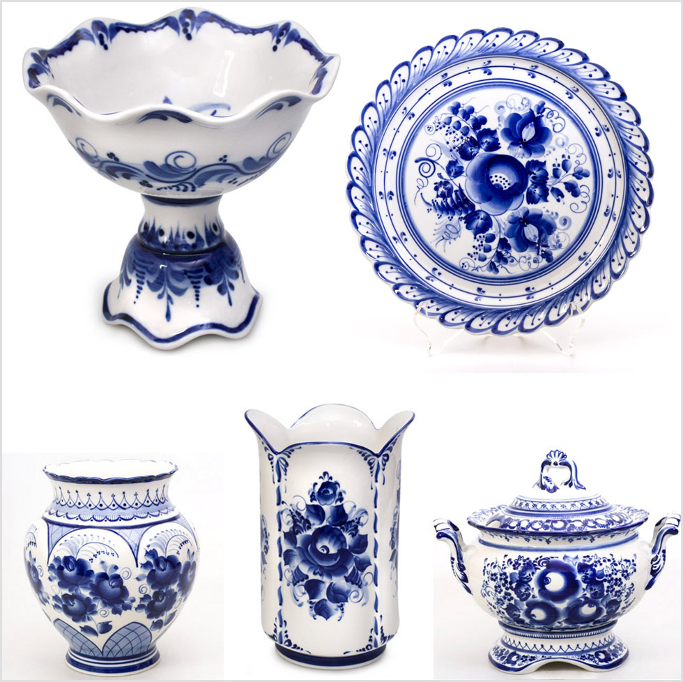
{all images courtesy of http://fromrussia.com: 1. dessert vase; 2. plate 3. tureen; 4. tulip vase; 5. vase}
Zhostovo style is wholeheartedly about flowers and fruit, full and sensuous. Richly coloured and lively, they are painted on a dark ground with a highlighted central area, so that the arrangement seems to glow from a central light source. Patterned borders take a backseat; they are often just in gold, quite simple, and are restricted to the very edges of the trays.
Zhostovo is a style used almost exclusively used on metal serving trays. The trays are painted black using several layers of a special variety of putty and oil varnish, and the painting of the design is completed using a soft brush and oil colours mixed heavily with linseed oil, in firm, successive brushstrokes. The piece is finished with several layers of lacquer, and polished to a deep lustre.

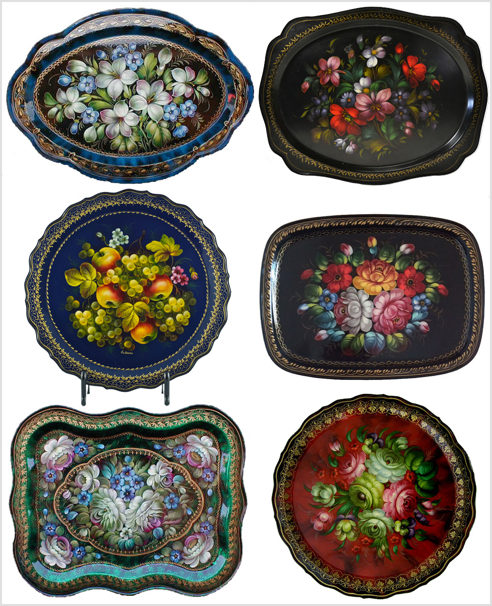
{images clockwise from top left: 1. http://russianlegacy.com; 2. http://lavishshoestring.com; 3. http://luckyporcupineco.etsy.com; 4. & 5. http://russianlegacy.com; 6. http://birneycreek.etsy.com}
Finally, as I noted in Part 1, these Russian folk styles tended to be used to decorate domestic objects, often having a central image surrounded by a simpler, more structured border. The stylistic elements are all there, and it is a matter of extracting them for reinvention as a repeat – push it, it’s a good challenge!