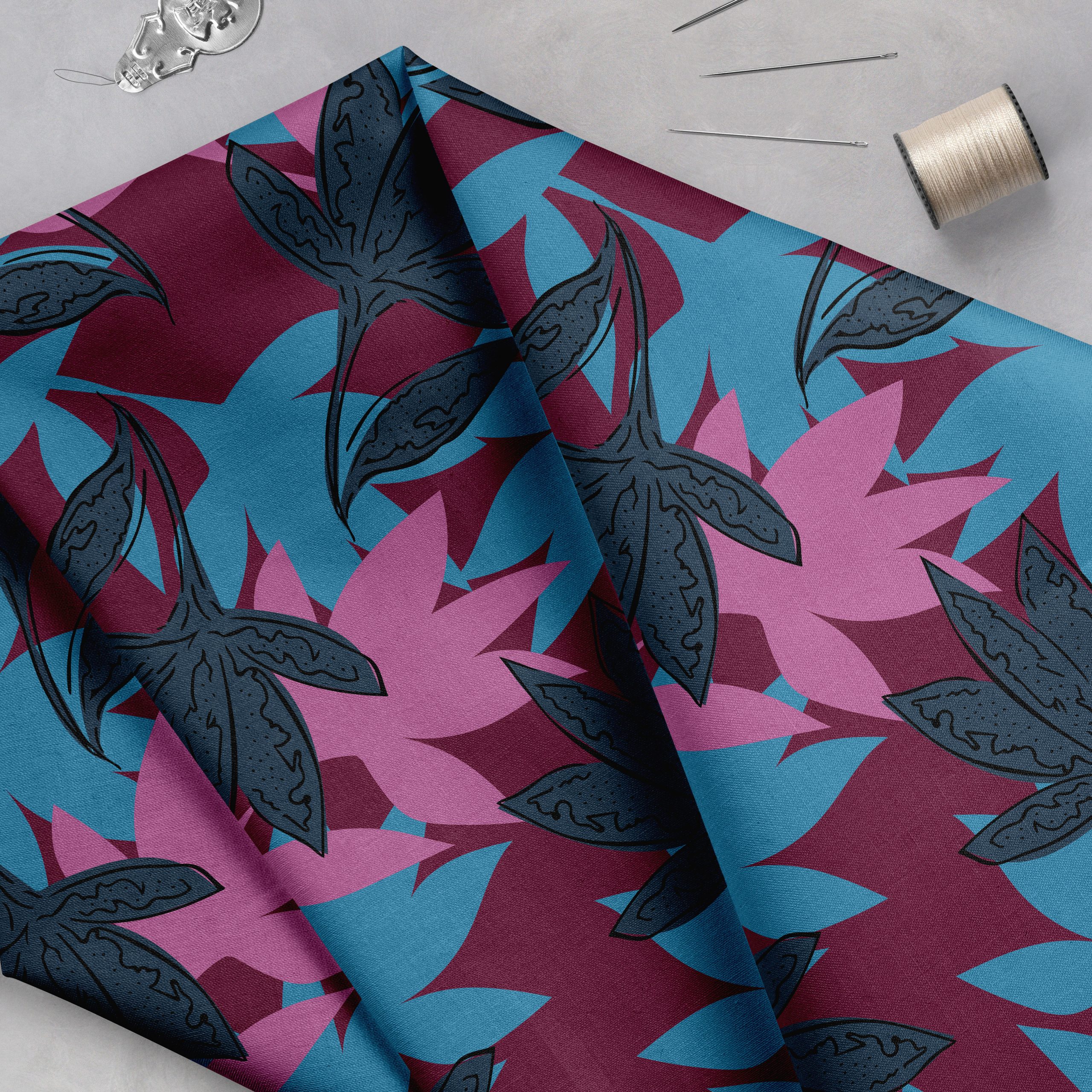
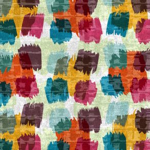
Some days it all comes together perfectly. Your pattern designs flow. You are able to sketch an interesting motif, bring it into Adobe Illustrator or Photoshop, and then copy and paste the motif repeatedly until it finally happens. Your pattern layout fills your art board. It’s an organic process, for certain, and the result is an eye-catching design that came together with ease. Original. Dynamic. Interesting. You feel like a rock star.
Then there are those “other times”…the ones when your art board looks too busy and the outcome states “the struggle is real”. Yet you don’t give up hope! You begin tweaking, moving your once beloved motif around and around the art board, hoping that the pattern layout will “click”. But it does not. Your pattern layout feels awkward and lacks flow. Frustration lingers and you dwell on all that wasted precious time.
In my experience there are several reasons why some motifs never seem to find the perfect pattern layout. There is one that seems to be more prevalent than others, though, and that is that we are trying to force a motif into the wrong layout style.
You see, each pattern layout style has a slightly unique personality. Yes, these layouts can be dramatically affected by the artistic style of the motif, the color palette, and the trend. However, generally speaking, I find that there is a perfect layout style for each motif and sometimes it takes several attempts to find the perfect match.
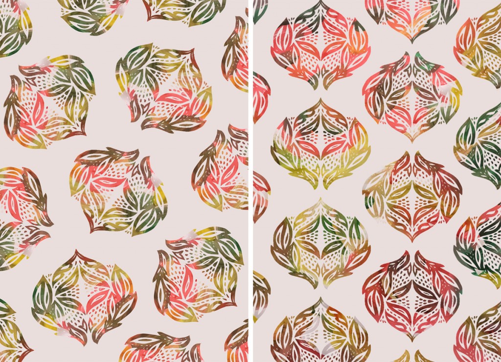
Let’s look at this example. I developed this flower motif that’s symmetrical and mirrored, which gives it a more formal feel. I first tried this motif in a tossed layout. Even though the motifs are placed in an even manner, avoiding accidental lineups, it feels a bit awkward and clunky.
In this second example I used the motif in a symmetrical and mirrored layout, which is more aligned to the motif design. And what a difference this simplified layout makes! It allows the motif to shine.
How did I make it work? I took a different approach. By looking to the motif for layout inspiration I discovered the perfect layout. But, what was important to this discovery was that I knew my layout options. I knew there were more options than the popular tossed layout. Without this knowledge I could have wasted hours, even days, moving the motifs around the art board or changing my color palette repeatedly, hoping to stumble across the perfect layout.
Experimenting and investing time into our work is an essential part of the process. However, we still need to recognize the tipping point—the point when we go from producing to wasting time on an unsustainable process.
Are you ready to stop wasting time pushing motifs around the page? Are you ready to design in a more empowered, informed manner? This is how you can begin sparking new ideas when you feel stuck or frustrated.


