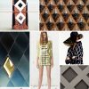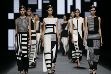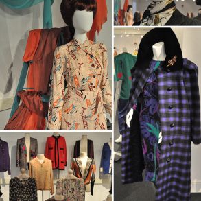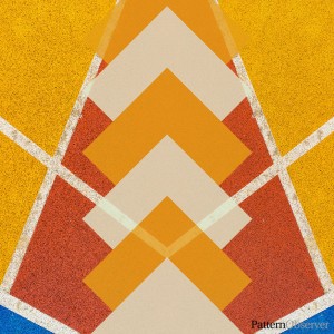
The Spring 2018 runway shows are in high gear and my Pattern Observer head is delightfully spinning with ideas. There are always so many trends to pick up on, but one that has really caught my eye is the use of extremely BOLD prints and patterns. Pattern sizes are increasing and bold pattern mixing continues to be a popular trend.
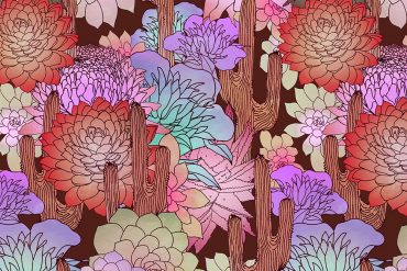
This bold styling is reflected in this month’s TDL design challenge, which our studio designers will be working on, as well. The overarching idea for this month’s trend is a super bold, almost punk take on classic back to school/fall patterns, and creating contrast within your design. Think super sweet florals paired with a bold stripe, or the flowers made bold through color or scale. Classic plaids or stripes can be enlivened and made modern through a palette of punchy primaries, or by adding distressed textures.
In our TDL design challenge I presented a cleaner, more vector-inspired take on the trend. However, how you choose to interpret the trend is up to you and your customer. As I was checking out our various Instagram hashtag feeds I began to see so many interpretations on this trend. It was so exciting and it confirmed that this is a trend that is definitely worth our attention for the Spring and Fall 2019 seasons.
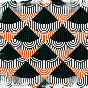
This pattern by Carla Lucena first caught my eye. Carla is a master at complex, bold geometrics. I love how she layered the simple diamond geometric with the scalloped, wave inspired pattern that brings more details and a beautiful sense of movement to the piece. I am a sucker for texture, so I also appreciated the weathered look present around the edges of the pattern. It’s lovely and if you’re thinking what I’m thinking – wow, I really want this hanging on my wall – you’re in luck. Carla has a beautiful selection of prints to choose from on her shop.
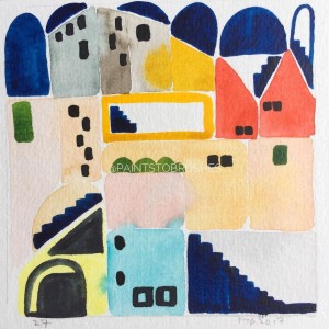
This piece by Farah (@paintstobrushes) caught my eye for several reasons. 1) I love buildings and slightly abstract representations of buildings. But most importantly, 2) I thought this was a wonderful take on the bold pattern trend. I love how the bold red, blue, and yellow that were chosen for this piece are slightly softened by the use of watercolors. I’m also drawn to the soft, organic touch that Farah used when creating the shapes and applying the colors. If your customer would be turned off by the clean bold look seen on the runway, using watercolors or painting your geometrics may be a unique spin on the trend that works for all.


