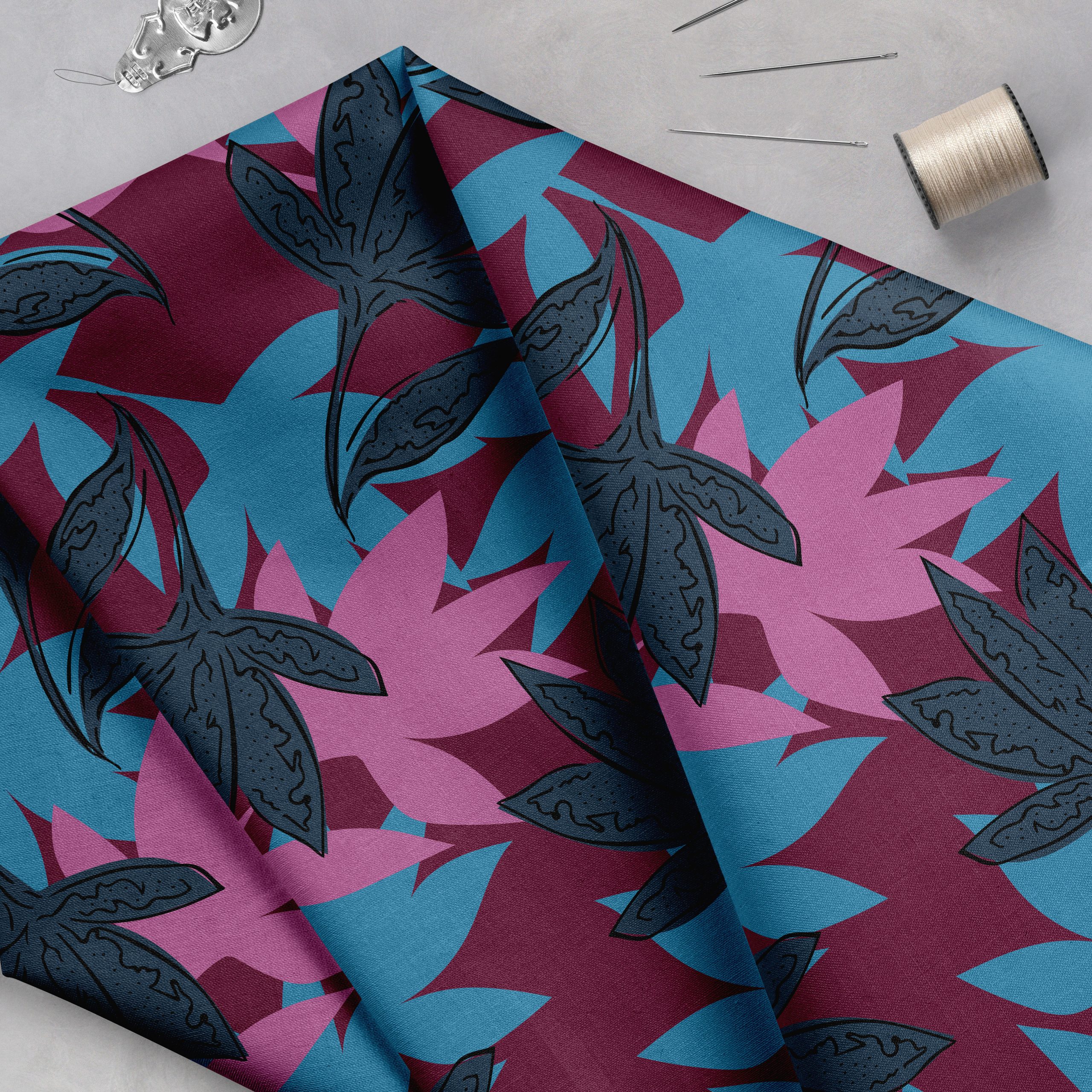
This week we are thrilled to feature the beautiful work of Catherine McGuire. We were drawn to her use of texture and rich colors and were even more delighted when we read her compelling story.
“I grew up in Savannah, GA and I always swore I would never go back because I love New England, but my father talked me into visiting the Savannah College of Art and Design (SCAD) when we were visiting a relative the summer before my senior year of high school. I fell in love with the campus and the options they offered, so I ended up going back to Savannah! I graduated from SCAD with a B.F.A. in illustration. The program was geared towards editorial, book, and advertising illustration, but I took one class with a professor who had worked in licensing and she introduced me to the market.
Flash forward to two years after graduation- I am married, living in Vermont (yay!) and I have been freelancing for almost 2 years! I jumped right in after college and started out knowing almost nothing about surface design. I feel like I have learned so much, and most of it the hard way! With the encouragement of some fantastic ladies in online circles, the best mentor ever, and hours and HOURS of researching and learning, I feel like I am getting to where I want to be! Thanks to the wonderful folks that organize the event, I exhibited at Blueprint Show 1 in NYC this year. I entered the Young Designers Competition with them early this year- I never thought I would win, but I did! I’m still a bit stunned, to be honest. I have been creating as many new designs as I can, and I have a fresh new portfolio of work that I took to the show.
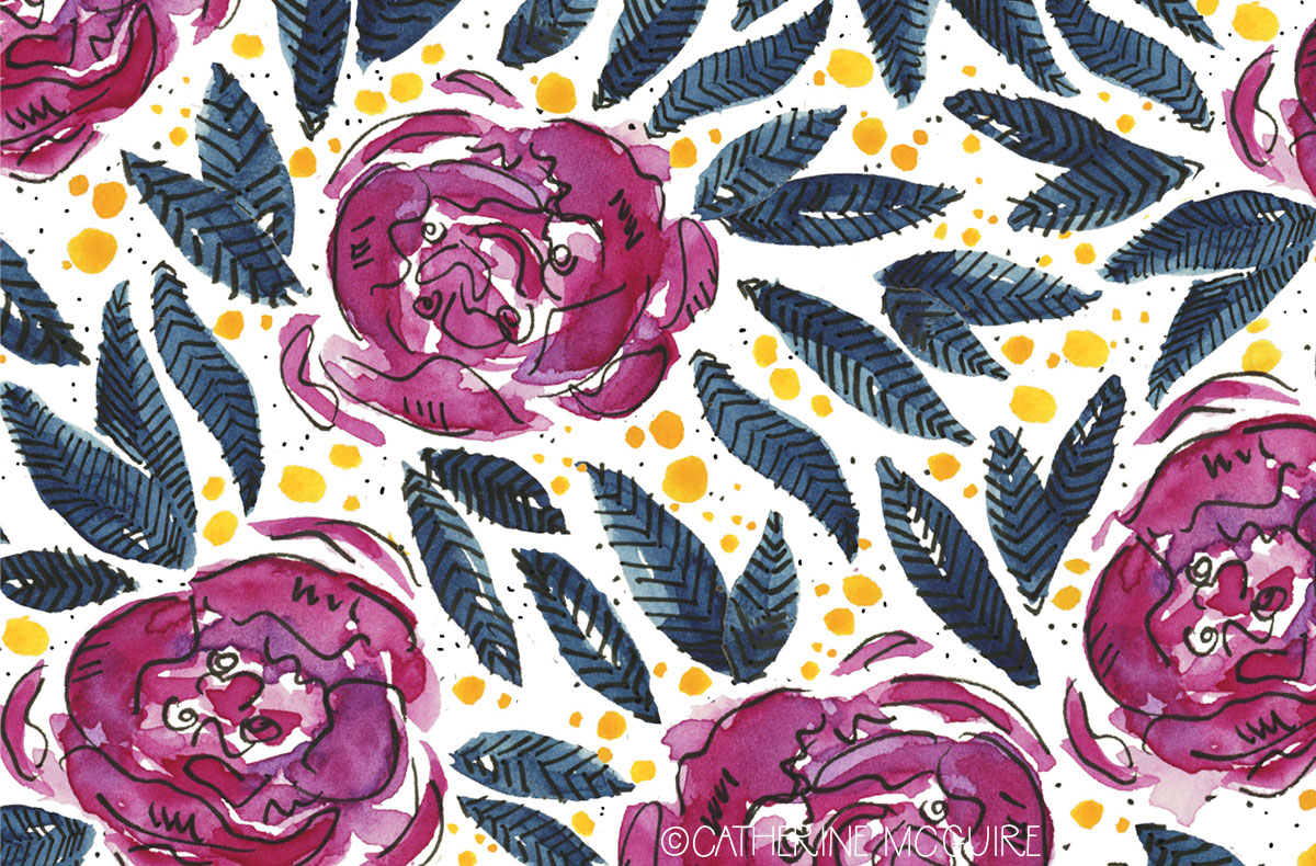
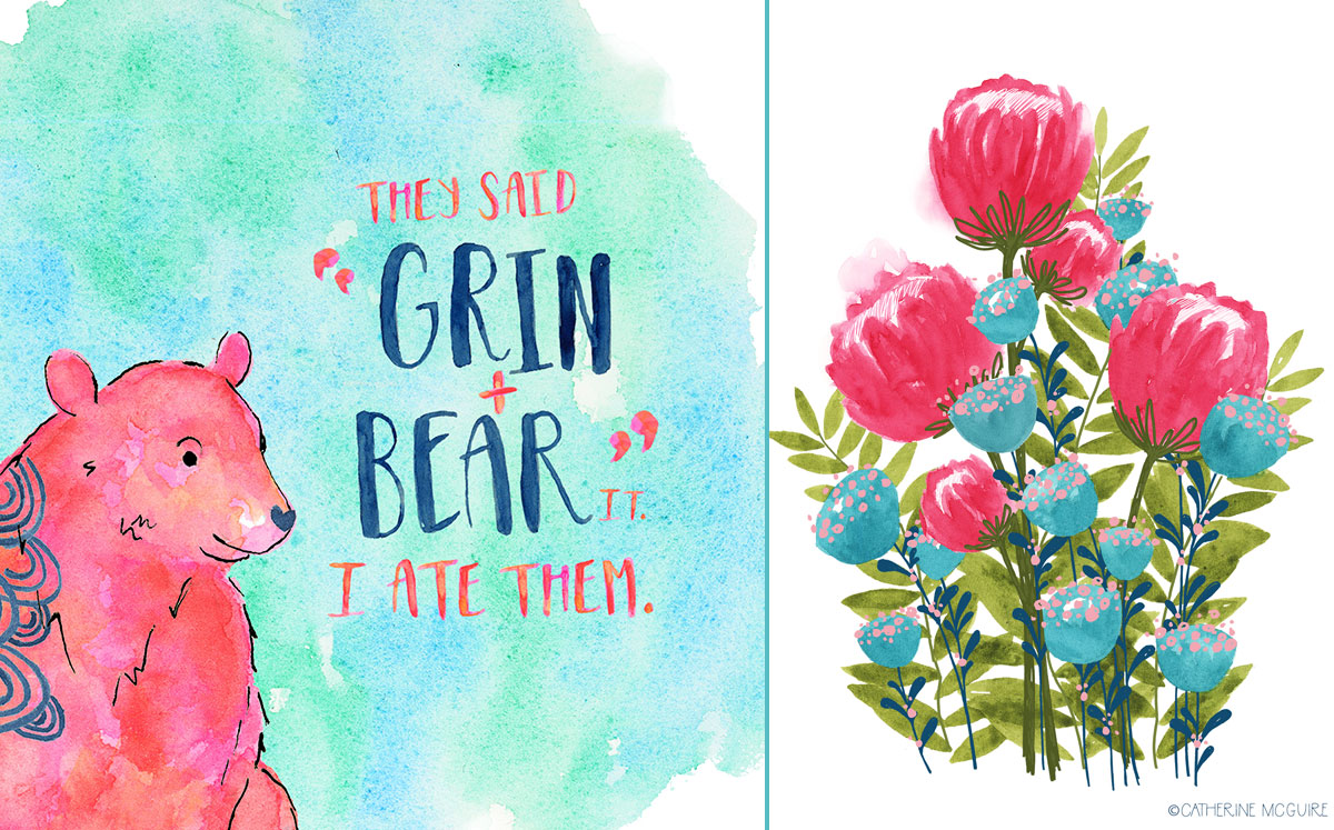
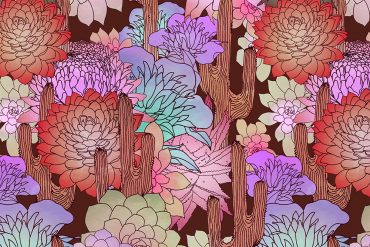
Last year I gave myself a break from designing and committed to just “play” with art. It was the best decision I ever made! I discovered a fresh way of working that I enjoy and that resonates with viewers. I think my goal is to imbue joy and energy into each of my paintings to pass along the happiness that creativity gives me. These images reflect my signature bright colors and cheerful themes. I have really gotten into lettering recently and have to fight from adding lettering to every single one of my designs! All of the lettering in these designs is my own. As you can see, I absolutely love navy, indigo.. anything on that spectrum. You can also spot my addiction to hot pink! Usually my designs reflect my own preferences, which is why almost all of them are animal or nature-themed. Over the last year I have added more digital work to my process. It started out as a way to simplify cleaning up my scans- if I ink on top of watercolor it can be hard to clean up, and the lines usually don’t look as sharp as I would like. Along the way I developed a few signature “doodle” marks, and I think that the loose lines add a bit of fun to the work. I have been sketching more and more recently, and it has made a huge difference. The little blue cacti pattern came out of a sketch, and it is one of my favorites! The dinosaur was also inspired by a 5-second doodle, as is most of my lettering.”
Congrats on attending Blueprint! How did the show go for you? If you exhibit your work again what will you do the same? Differently?
“The show was great! In the end, the show itself was the least stressful part of the whole process! After a few months of working long, long days and weeks to get ready it was refreshing to just get to the show and chat with other artists (and clients, too, of course!) The show itself has such a lovely friendly, casual atmosphere. And I really love how easy set-up is for Blueprint. I have heard others say that set up for other shows can be a ton of work. Next time I will try not to stress so much!
I am hoping to exhibit at Blueprint in NYC next year, and at some point in the next few years, I would love to try out the San Francisco show.
A few things I am glad I did: A lot of people print their sell sheets on paper sizes like 11×17″ and 13×19″. My work tends to be in a tight format, and I was pulling my hair out trying to figure out how to make my designs fit on the sheets. A kind mentor and friend encouraged me to just go with what worked for me, so I did! I printed my designs on 11×14″ paper, and they looked fabulous. I also saw that a few others seem to have gone with 11×14″ sheets, too. My advice to first-time exhibitors is: don’t worry too much about how others are doing the show. There are great resources like the Facebook group where you can ask questions, but in the end just be yourself and show off your art!
The big thing that I wish I had done was created more work, but since I only had about two and a half months to prepare, I didn’t get the time to build up the portfolio that I wanted. I worked like crazy, though, and I was pretty happy with how much artwork I did end up taking with me. I am going to slowly start preparing for next year’s show in the next couple of months, then ramp it up to make a ton of fun work by next May.”
You mentioned that last year you committed to “just play with art.” What did this process look like? How did you stay focused on the “play” aspect of this challenge?
“It is kind of hard to describe the “play” process that I went through to recharge my creativity. I think the majority of it was psychological- allowing myself to try new things AND forcing myself to stop over-thinking what I was doing. I had a problem with overthinking my concepts, and I realized that I also put tremendous pressure on myself to create something great every single time I painted. Which, we all know, is impossible! I took two months off from making designs to sell and focused on trying new things. I am sure most other designers understand- it’s hard work to not work!
Besides those mental roadblocks, I had to work through my “creative vocabulary.” I was surprised to realize that I was subtly using the same framework of imagery and ideas over and over, and my muscle memory was actually keeping me from being able to mix things up! I looked at shapes, colors, and themes in artwork, online, and on products at my favorite stores and doodled things in my sketchbook to see what I could learn from them. I took basic concepts and branched out, made messes, and had fun… and I made a lot of work I didn’t like at all. Even that was important, and the results that I did like were definitely game-changers. For example, the process led me to then use brighter colors and more abstract shapes in my work when I decided to hop back in. I also started allowing myself to create more patterns and geometrics from doodles, which is just so much fun. Some of the patterns I have created while sitting on my sofa watching a movie are my favorites!
I think stepping back and making myself do things in ways I hadn’t before really opened up possibilities, and I am having so much fun exploring new ideas that pop into my head! It really did open up my creative mind, and now I make sure to keep learning and playing as I go along.”
You can explore more of Cathrine’s work on her website.


