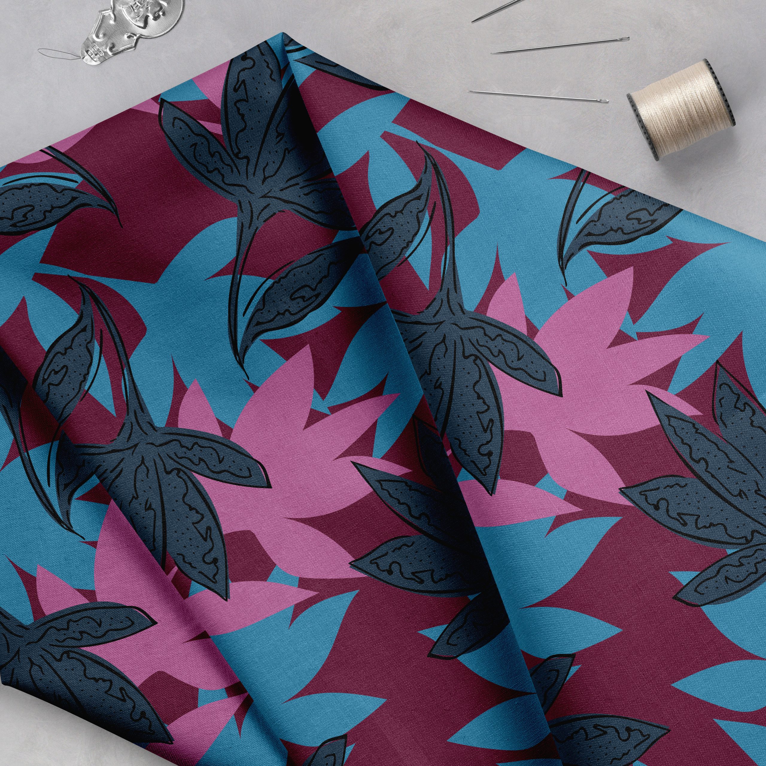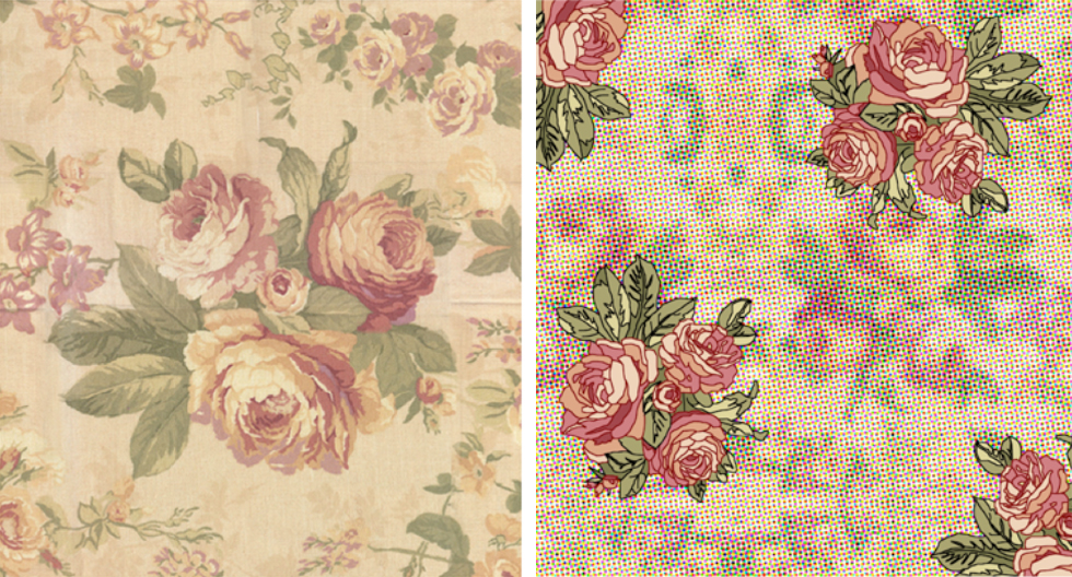
Each month in The Textile Design Lab we share a pattern design tutorial to introduce new techniques and concepts and help give our students an edge in this industry. This month Julie Gibbons has created a tutorial based on her latest textile history post on the Pop trend of the 1960s. Below is an abbreviated version of the tutorial that is available to members in The Textile Design Lab. Learn more about this online community here, and register to gain access to the full post along with e-courses, webinars and other great content. Enjoy!
What is Pop?
Pop was an art movement which came about as a reaction to the burgeoning mass production and consumerism around the middle of the 20th century. In its artworks, it embraced the words and aesthetics of advertising and newspapers, and the overwhelm of cheap multiples of everything and easy access to consumer goods.
Pop icons Andy Warhol and Roy Lichtenstein probably best expressed this zeitgeist – all manner of things were considered fair game for appropriating and reinterpreting through Pop ideas. Mass-produced ideas were reproduced en masse – multiples of Campbell’s soup cans and portraits of Marilyn Monroe came from Warhol; brushstrokes of a paintbrush reinterpreted through a bold cartoon aesthetic and half-tone screen by Lichtenstein with his tongue firmly in his cheek. Images were simplified and intensified with colour in rich, vibrant hues. (For a more in-depth look at Pop, check out Julie’s latest textile history post here.)
So, let’s see what we can do with these ideas now.
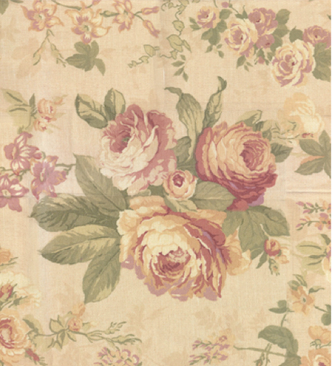
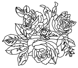
Throughout the drawing, I kept toggling the white layer every now and again to see what the outline was looking like; that way I could simplify or modify it so that it made more sense as a picture of roses, and so that I didn’t miss anything. It was also useful to ensure that these lines formed complete outlines, as I will be using the Paint Bucket to fill the spaces – and I didn’t want to flood everything with one colour! I spent a bit of time tidying up stray lines, odd points and loops by adding and deleting Anchor Points (use the Path Selection tool, select a path by clicking on it, then right-click to add or delete Anchor Points as you wish).
***Reminder! Tomorrow, March 25th, at 11am PDT, we will be hosting a FREE webinar on the importance of developing collections. We’re hosting this webinar in celebration of the upcoming Sellable Sketch Group-Study which begins on March 31st in The Textile Design Lab. Please join us! Learn more about what will be discussed in the webinar and register for your spot here.
To learn how to create a collection that is the perfect balance of your authentic style, relevant trends and your customer’s desires, join us for The Sellable Sketch Group Study.***

