This post on Op art patterns is part of a series on the history of surface design by Julie Gibbons.
The Sixties was a wildly vibrant time for surface design, reflecting the general mood of the era. After the eloquent restraint of the Fifties and its interest in the organic and the atomic, designers revelled in the large, the colourful and the boldly graphic.
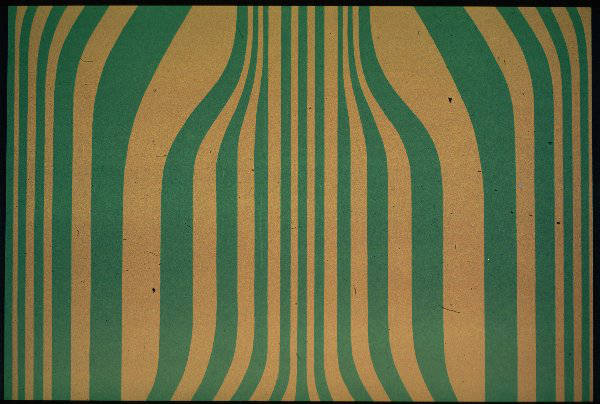
There were several threads that wove their way through Sixties style; each with its particular set of drivers. Op Art Patterns was one such trend, and grew out of experiments in painting by artists such as Bridget Riley and Victor Vasarely. These prominent artists worked in flat colour and constrained shapes, and one of their concerns was how the eye responded to optical tricks. Through the use of distortion, they converted flat surfaces into areas that appeared to shift and warp.
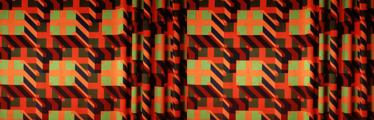
Op Art Patterns were uncompromisingly bold, often using the starkness of black and white to its best advantage. Vibrant, saturated colours such as hot pink, red and ultramarine were also popular.
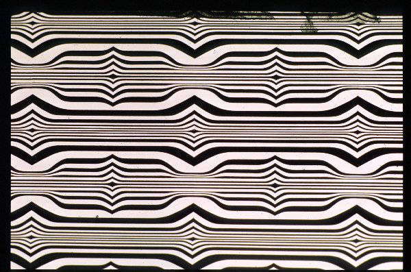
Verner Panton was an ubermeister of Op Art Patterns during this period. Best known for his injection-moulded plastic chairs, the Danish designer also produced textiles, interior designs and was an impressive colourist. His standout surface work was a stark black and white gridded arrangement of circles called Geometry 1, and it was also one of his earliest. Other notable designs were Spectrum and Optik, both produced in various colourways, but again, perhaps at their best in black and white.
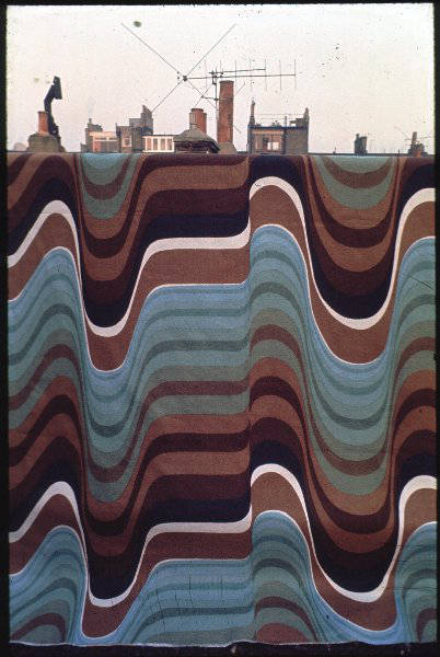
Barbara Brown was another stellar designer, who characteristically used three-dimensional effects in most of her pieces. Working for Heal Fabrics in Britain (who also counted Lucienne Day as part of their ensemble), she produced a huge number of popular designs, including Frequency, Expansion and Galleria. She favoured large-scale works, with one repeat often covering the width of the fabric.
During the mid Sixties, designers started to mix it up with influences from a wide range of other cultures and time frames, including Pop Art, folk and ethnic art, Art Deco, psychedelia and an interest in the burgeoning computer age, resulting in an explosion of colour and exuberant forms. Explore Part Two here.