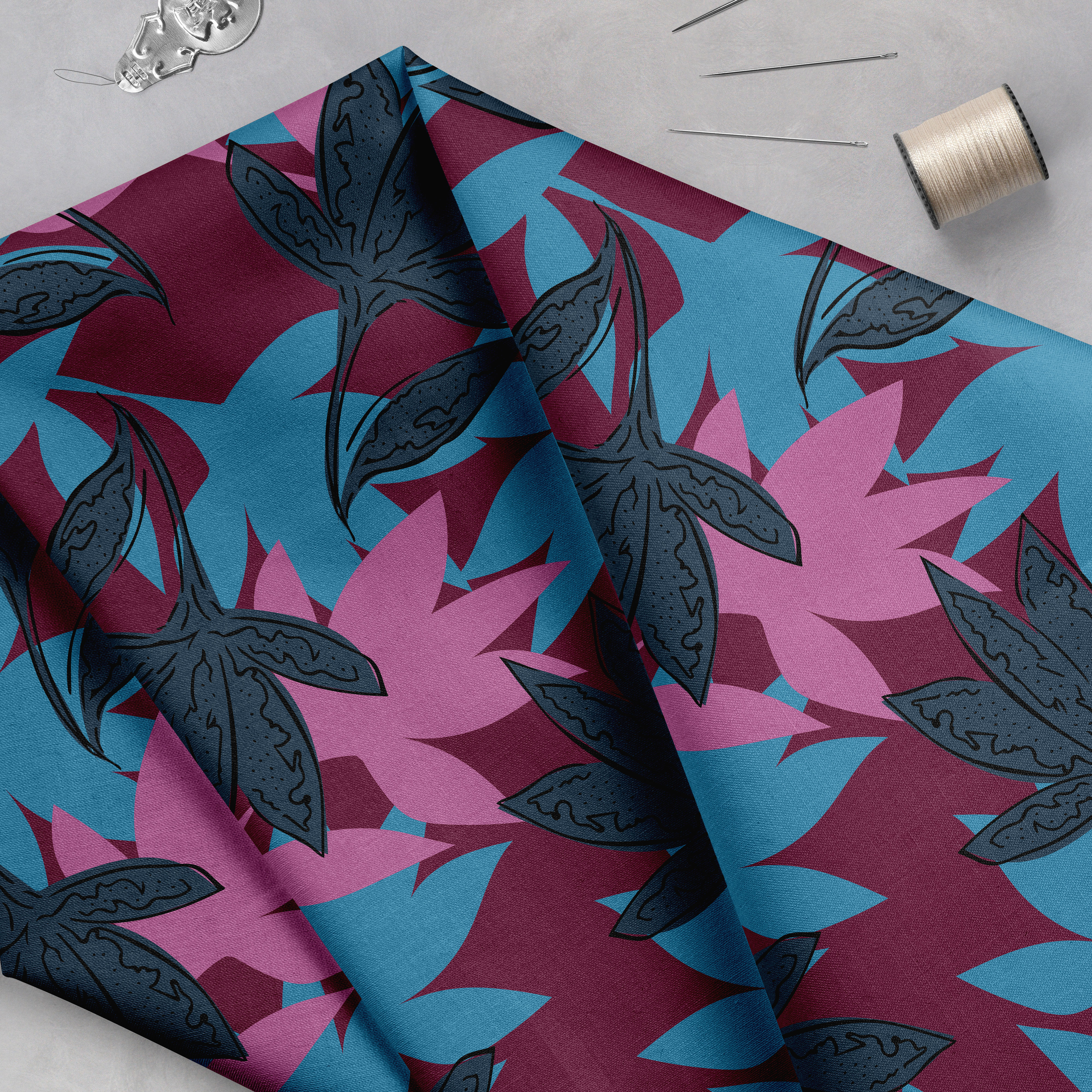
Each month in The Textile Design Lab we share a pattern design tutorial to introduce new techniques and concepts and help give our students an edge in this industry. This month I am excited to share my tips on improving your floral prints by making simple adjustments in your layout.
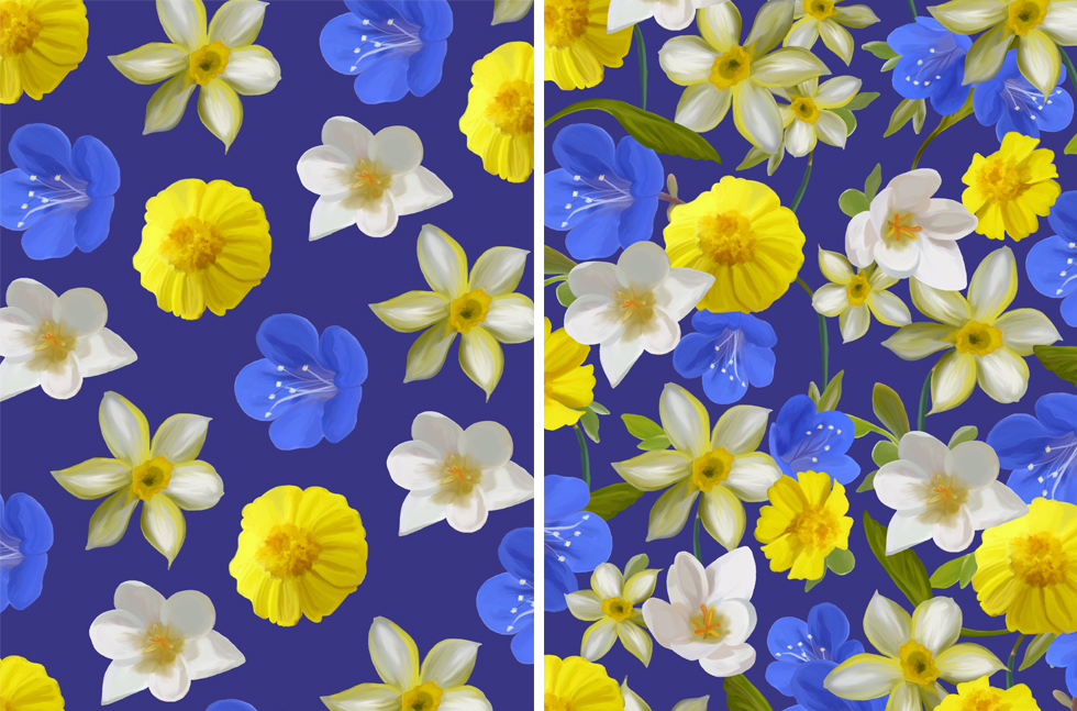
Take a look at the two images above. What makes the print on the right a more polished, complete print than the one on the left? What are the weaknesses of the print on the left?
The first thing that stands out to me is that all of my motifs are facing the same direction. There is no variety in the angles of each flower, and this makes for a rather boring print. The print also has a very directional feeling due to the centers of each flower pointing to the left. My eyes are directed off the page rather than moving around the print, which would be the goal in a successful layout.
In the full tutorial I walk you through 5 key steps that will transform this original pattern into the finished pattern on the right–simple ways to create more professional, polished floral layouts.

Florals are always in season, and while styles do change, florals are consistently one of the most popular and best-selling motifs out there and are a key component to include in your portfolio. Speaking from a personal standpoint, florals have never been my favorite print to create. I will wear them all day long, but put me in front of a computer or a sketchpad and I would rather create a complex geometric or a beautiful texture than a floral print. But I came to learn that florals are absolutely necessary to your portfolio, and even if they aren’t your favorite, they should still feature prominently in your body of work because they are always in demand! I found this out the hard way at an interview for an internship while I was in school. I pulled out my portfolio and the interviewer started flipping through it, much quicker than I was expecting. She then asked “do you have any floral prints? We are big on those.” And I was able to show her a grand total of 2 floral prints! I hadn’t even realized up until that point that I was so lacking in this major print category, and needless to say, I did not get the internship. My point here is, a diverse portfolio is important, but don’t forget to include the classics like florals, stripes, and plaids, among all of the fun, experimental stuff.
Join The Textile Design Lab to download the full tutorial and learn 5 key ways to give your floral prints a boost. And take a look at our Pinterest board for examples of some great floral layouts seen on the Fall ’14 runway!