Each year, the Pantone Color Institute selects its Pantone Color of the Year, and for only the second time in its history, Pantone has chosen not one, but two colors to represent the mood and trend direction of 2021. The chosen colors are a mid-tone gray and a bright, sunny yellow, PANTONE 17-5104 a.k.a. “Ultimate Gray” and PANTONE 13-0647 a.k.a. “Illuminating,” respectively.
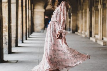
There always tends to be some controversy and differing opinions surrounding the Color of the Year, and this year is no different. Having been released approximately a week ago there have already been a number of think pieces written about the colors, with opinions split between those strongly in favor and those who find the combo uninspired. While in all honesty I do personally find the yellow and grey combination to be a bit overdone in the design world, I do appreciate the symbolism in the colors for the time we are living in. I imagine the yellow as the sun emerging from behind gray clouds, or the promise of emerging from this incredibly trying year of 2020 with some hope for a better year ahead. Yellow is such a positive, happy color, and I for one recently bought a bright yellow parka to get me through the upcoming winter months. Gray provides a subdued contrast that some might find dull or even depressing, but it also carries other meanings.
Inspiration for Pantone Colors of the Year 2021
As Pantone describes it, these “two independent colors that highlight how different elements come together to support one another, best express the mood for Pantone Color of the Year 2021. Practical and rock solid but at the same time warming and optimistic, the union of PANTONE 17-5104 Ultimate Gray + PANTONE 13-0647 Illuminating is one of strength and positivity. It is a story of color that encapsulates deeper feelings of thoughtfulness with the promise of something sunny and friendly.
A message of happiness supported by fortitude, the combination of PANTONE 17-5104 Ultimate Gray + PANTONE 13-0647 Illuminating is aspirational and gives us hope. We need to feel that everything is going to get brighter – this is essential to the human spirit.
As people look for ways to fortify themselves with energy, clarity, and hope to overcome the continuing uncertainty, spirited and emboldening shades satisfy our quest for vitality. PANTONE 13-0647 Illuminating is a bright and cheerful yellow sparkling with vivacity, a warming yellow shade imbued with solar power. PANTONE 17-5104 Ultimate Gray is emblematic of solid and dependable elements which are everlasting and provide a firm foundation. The colors of pebbles on the beach and natural elements whose weathered appearance highlights an ability to stand the test of time, Ultimate Gray quietly assures, encouraging feelings of composure, steadiness and resilience.”
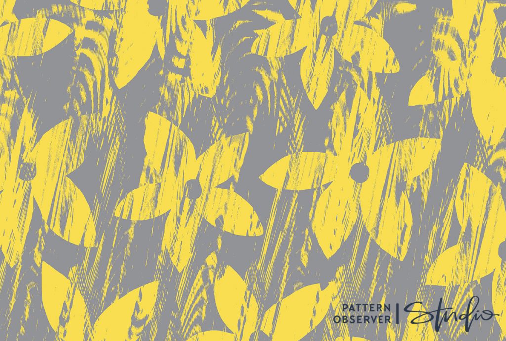
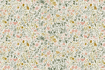
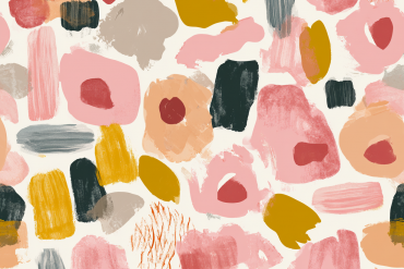
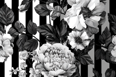
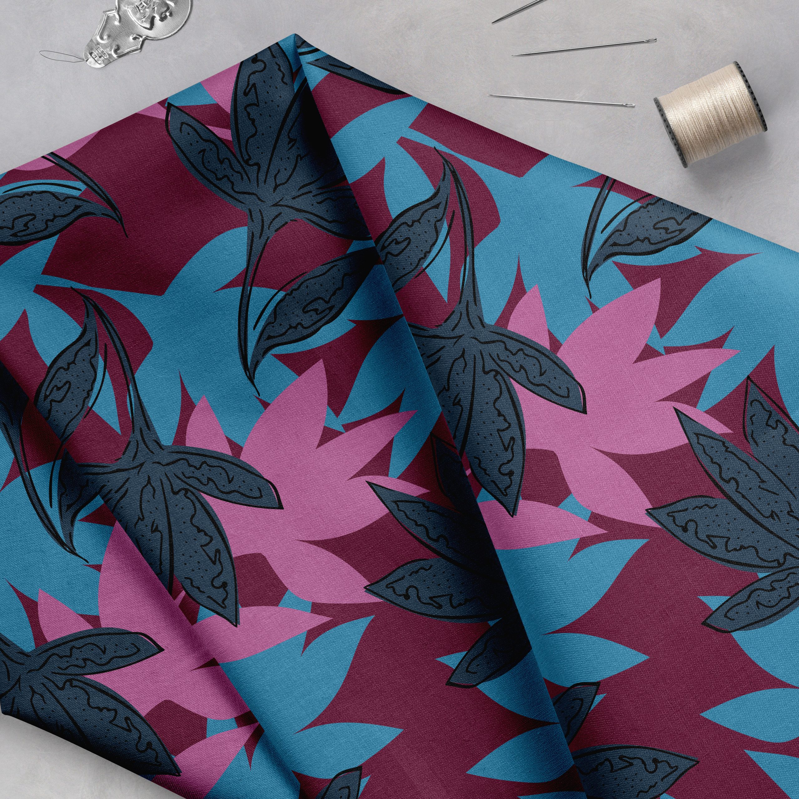
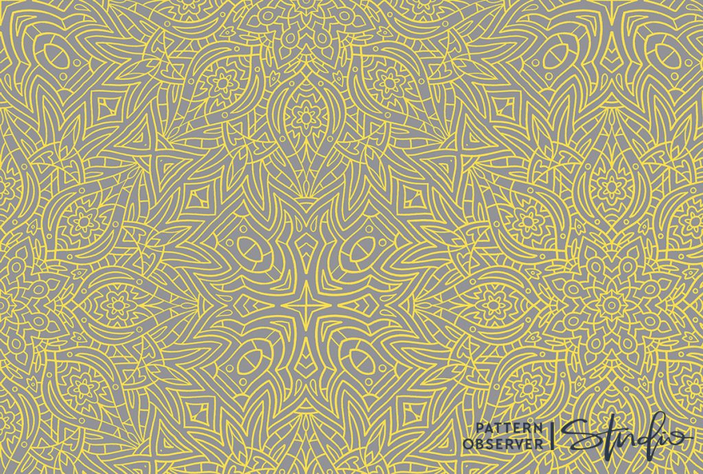
Yellow has been a notoriously difficult color to sell in the surface pattern design world, but according to WGSN’s catwalk data it is one of the top three brights being seen on the runways for S/S 21. So now’s the time to go for it if you’ve been shy of this color in the past! You may find it easier to work with yellow as an accent color rather than as the main color in a print, and the great thing about having gray as its companion color is that it provides a nice neutral base that can temper the brightness and loudness of the yellow. For those who find grey unexciting to work with, note that according to WGSN “Grey has shown season-on-season growth since A/W 19/20, shifting from 5.1% to 7.2% to reach 8.3% of the colour mix in S/S 21.” So pattern buyers are going to be on the lookout for designs that feature grey in the year ahead–try to include it in your palettes for 2021!
Building Color Palettes
Speaking of palettes, Pantone has offered up some lovely ideas for other colors to incorporate with Ultimate Gray and Illuminating. These inspiring palettes can be found at here and include:
Intrigue
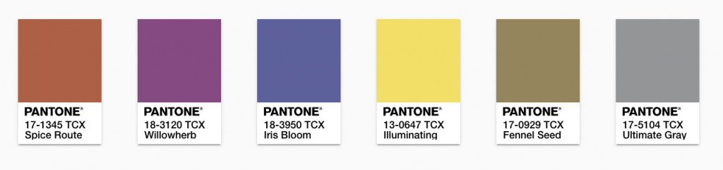
Sun and Shadow
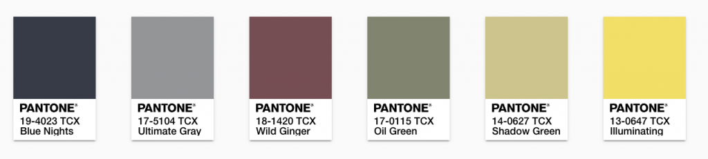
…and others. I love the difference between these two palettes, both of which feature Ultimate Gray and Illuminating, but have such different feels to them. The Intrigue palette showcases three other brights so that the yellow is not such a stand-out color, while Sun and Shadow takes a more neutral approach with calm, earthy shades and a rich navy to balance out the brightness of the yellow. To dive deeper and start making the Colors of the Year your own, you can create your own palettes, explore trending palettes and play with various other color-related tools at https://connect.pantone.com/#/color-of-the-year.

We can’t wait to see how you use these colors in your pattern designs! Tag us #patternobserver on social media so we can see what you come up with! -Chelsea