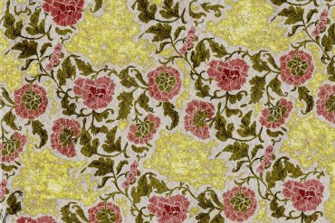
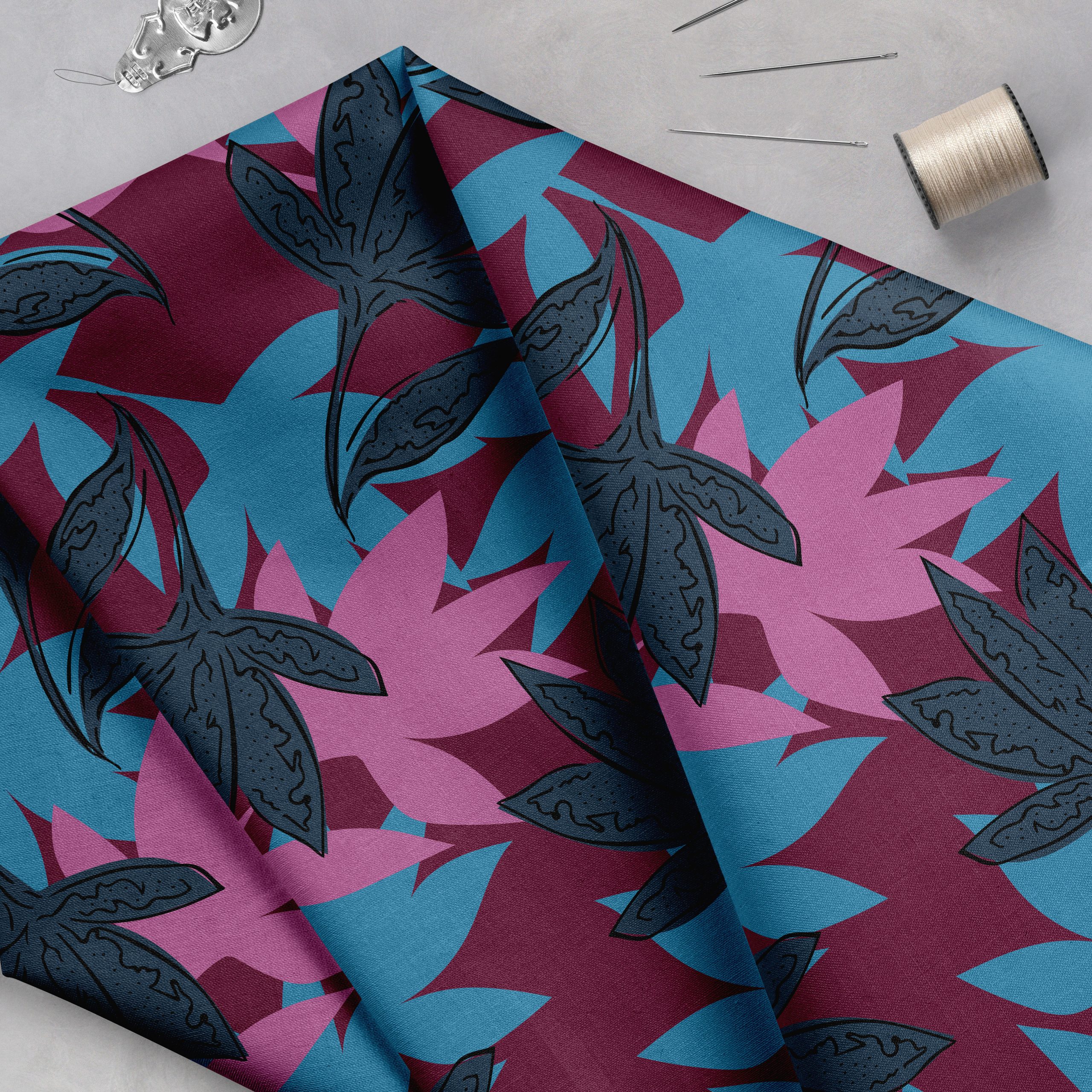
The trick with writing a tutorial on color in textile design is that there is no right and wrong way to use it. Name any color mixing rule, and I’ll happily show you artists who have broken it to great effect. So the rule no. 1 of effective color use is ‘if you’ve found a combination you feel good about, go for it.’ But if you struggle to find balanced palettes, or you keep reaching for the same tones every time, or you feel there’s something missing from your colorways, this article may give you some fresh takes on the whole color thing.
THE BASICS – COLOR THEORY
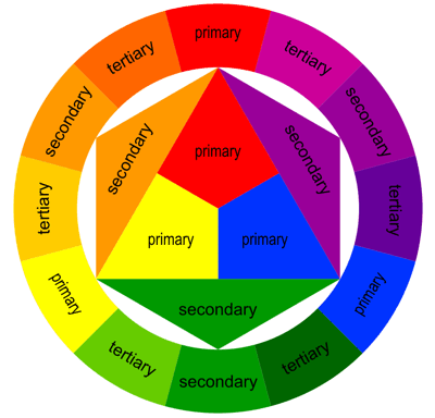
Color theory is a set of basic rules and definitions that help us understand how colors behave and interact. The starting point of color theory are the three primary hues – yellow, red, and blue, which mix to create secondary and tertiary hues. These twelve hues – three primary, three secondary and six tertiary colors – form the basis of the color wheel, which can be used to explore color relationships. (Go here for a fun interactive color wheel that will let you highlight each of these groups.)
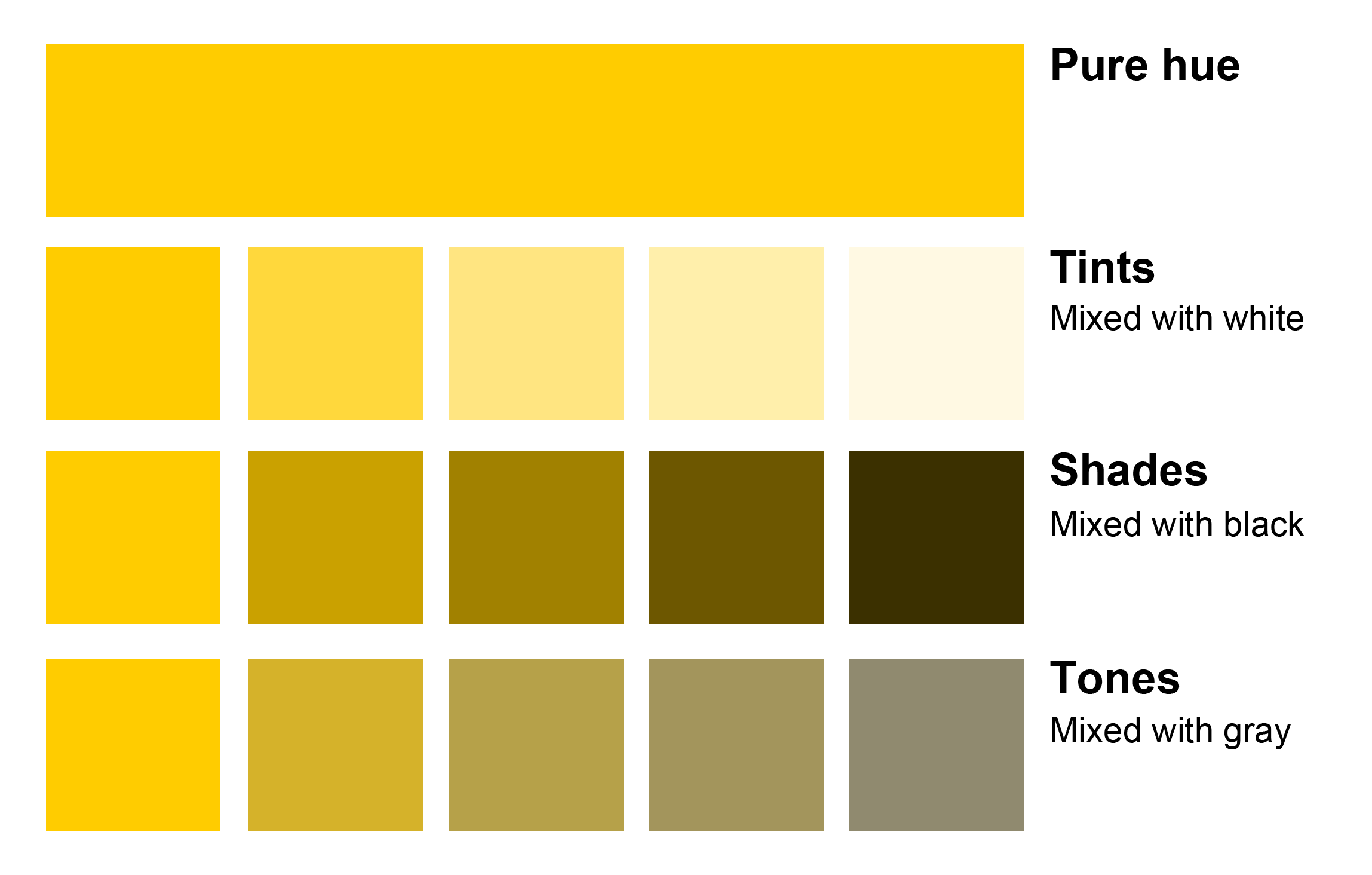
The color wheel contains pure hues – i.e. colors with no addition of white, gray or black. There is a slew of confusing terminology and definitions regarding color variations – you’ve probably heard the terms color, hue, chroma, saturation, tint, shade, tone, and more. The definitions for each of these terms vary slightly from source to source, but it is not essential to memorize them. The essence is this – you can modify each hue from the color wheel by mixing it with white, black, or both:
These four basic parameters – hue, tint, shade and tone, let us recreate billions of individual colors the human eye is capable of discerning. Color theory can quickly become math and physics if you want to go into how light works and how we perceive it, but for the purpose of making art we’ll leave the theory at this level.
All the colors we are capable of making – and seeing – together form the color spectrum. One thing to keep in mind is that the scope of the color spectrum is different depending on what you plan to do with your colors. Our eye can discern billions of distinct colors, your monitor can display millions, and the best printer can produce thousands, but a screen print on fabric won’t be able to include more than a dozen. At first this may seem like a crippling limitation, but I’ll show you later how it’s actually a blessing.
HOW WE COMBINE COLOR IN TEXTILE DESIGN
There are a few main models for choosing an effective color palette:
Contrasting and complementary palettes – contrasting colors are separated by other colors on the color wheel. The more colors stand between them, the higher the contrast. Colors that stand at the opposite ends of the color wheel have the highest possible contrast – we call them complementary, or clashing colors.
Variations of contrasting color combinations are the triadic, tetradic, split-complementary, and square color scheme. http://www.tigercolor.com/color-lab/color-theory/color-theory-intro.htm
In spite of being accused of clashing, these colors provide great impact and visibility, and can be used together to great effect.
Analogous palette – opposite of contrasting colors, analogous colors stand next to each other on the color wheel, and they support each other when combined. Since they come from a similar place their transitions are gentle and the overall effect they give is one of harmony and balance.
Monochromatic palette – a monochromatic palette will focus on a single hue and use its tints, shades or tones to support it. Monochromatic palettes can feel very gentle and soothing, but they can also run the risk of feeling samey and too timid. To ensure a good effect you can play with the values (amount of black and white) you add to your chosen hue, and the effect can be quite stunning.
A monochromatic palette can also be very powerfully enhanced by small contrasting highlights.
Faux monochromatic palette – one thing I like to do is make a palette that is almost monochromatic, but in fact includes subtle hue shifts. Note how much richness these slight variations add to the piece, even though the overall feel is still monochrome:
Tints, shades and tones – when you’re picking your palette, it’s safest to start from a set of colors which live in the same neighborhood on the tints, shades, and tones scale:
You can always tweak your choices later for added interest.
WHERE DO WE FIND OUR COLORS?
Use dedicated resources
There are many sources that provide artists with pre-made color schemes, many have been listed before but I’ll mention them anyway. These can be helpful when choosing color in textile design:
Sites
Blogs
Steal them 🙂
The problem with these is that in most cases they offer an abstract color scheme, which is sometimes difficult to imagine applied to your piece. You can, of course, always hunt for applied color schemes, searching for photographs or artwork which has the color feel you’re searching for on sites like behance, tumblr, or pinterest, and then extracting a palette from them, either by using one of these tools, or simply by taking a color picker to the image and hand-picking the tones yourself. You might feel a little weird picking a color palette from another artwork, as if that’s some sort of theft, but I assure you your end result will not resemble the source except in the most general way. While we’re touching on this subject, I also want you to look at this TED talk by Austin Kleon called ‘Steal like an artist’ – It might help you view art theft in a new light – both in what you can take from others, and in what you let others take from you. Blatant plagiarism aside, don’t forget – no one can ever steal your artistic voice. That’s why art is so cool 🙂
Let them grow out of your artwork
In truth, I have listed those first two methods but I have personally never had any success with either of them. The only way I ever manage to make a color palette is to let it grow out of the piece I’m making. This goes against the general design wisdom of choosing your palette before you start designing, but the fact is that until you see a color applied to exactly the shapes and forms that you are using in your piece, you have no idea whether it will work for you or not. Making a palette from scratch can be a little disorienting–in the full tutorial I list out 11 of my favorite do’s and don’ts, as well as some basic techniques and technical tricks for Photoshop users.
Join the Textile Design Lab to read the rest of this post for lots more information on how to use color! As a member you will also have access to our upcoming 2 week e-course on Blogging for the Pattern Industry which is free to all members. The course begins Tuesday May 27th and you can read more about it here.
Have a great week!
*Post by Lidija Paradinovic Nagulov, who designs under the name Celandine. All images created by Celandine. This is an excerpt of a longer post available to members of The Textile Design Lab. Join now to gain access to the full tutorial along with e-courses, webinars and other exclusive content. Enjoy!

