Developing Professional Pattern Layouts

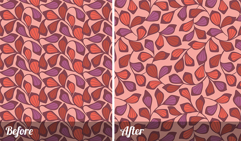
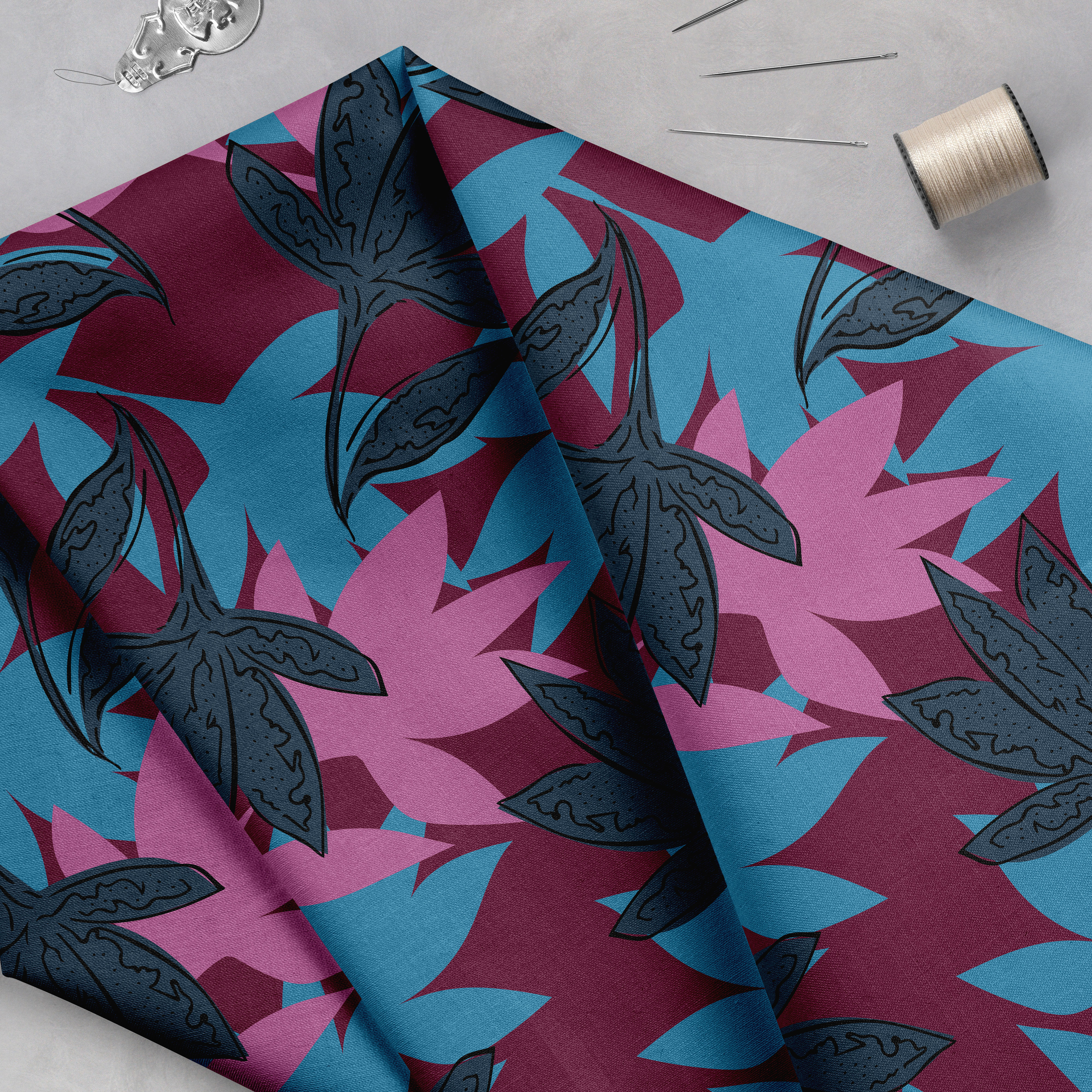
Today I want to discuss one of the simplest ways to begin creating (and sharing!) stunning patterns. When designers first enter the pattern design world, they typically illustrate several elements and arrange them in a small layout, such as a four inch square. They then duplicate this layout to fill the page. This is a natural and logical way of working, and is fine for many patterns, such as small scale florals or dots. However, when working with midsize to large motifs, developing larger pattern layouts is a wonderful way to easily improve the quality of your artwork. Let’s look at this example:

The smaller pattern repeat on the left is fine, and depending on the market it may be acceptable, but fine and acceptable are not what we are aspiring towards. The larger repeat on the right took a little longer to develop, but is more impactful and appealing to the eye. Don’t you agree?

Spending more time on your pattern layouts will allow you to charge a premium, bring more visibility to your business, and you will begin to feel confident in your work. When you feel confident in your work, you will share and market your work with ease.

The next time you develop a pattern, try investing an extra hour into drawing additional motifs or transforming existing objects into a larger area of artwork. This can be done by copying the motifs and then flipping, rotating or adjusting their size. You will find the time to be well spent and a wonderful investment in your business. This concept may seem so simple, but sometimes the smallest changes to our creative process can have the most impact.


  1. Hi,
    I have often thought ‘I wish they had just spent a little longer on that pattern’ when clothes shopping, so this article rings true to me!
    Bron

  2. Thank for this Michelle, they do look much better in the second option, so hopefully I can get the concept to flow through my own work.

  3. Great point, I think a lot of that is just giving your print room to breathe and the eye places to rest. The eye has got to have places to move in and around the print and not get all clogged up. Much easier to do this in a larger repeat, or even just a half-drop – it makes you think about how to fit it together to work better and gives it a flow.

  4. I’m a newbie in the Surface Pattern Design career. And noticed that my initial prints look too small when converted into a big item such as duvet covers, shower curtains. They appear very tiny, I’m not satisfied with it. Thanks for this! Looking forward to the training. 🙂

  5. Hy,

    I really love your blog. It’s really helpfull. 🙂

    I am a begginer with no studies of design. Fo 3 years I am learning to draw and paint. 🙂 I just love surface pattern design for fabric.

    I was asked by a small fashion house to vectorize an old pattern from a piece of fabric and make a new pattern for a 1500 mm length of fabric.

    It’s mostly small flowers. Do I make the repeat 30 cm/30 cm? And can you advise me how much to charge them?

    Thank you. 🙂 Have a nice day. 🙂

  6. I’m new to pattern design and there is an issue I have been struggling with. I’ve attempted the pattern several times and end up abandoning it. The overall design is a woodland theme with a red-winged blackbird. I have tried a half repeat and flipping the blackbird several times, and it doesn’t seem to matter — your eye always goes directly to the black element. I’ve inquired in other forums, but the only advice I’ve gotten is to introduce more black into the overall pattern, to disguise it a bit. Do you have any tips on working with a larger, solid color element in your pattern so that the eye doesn’t immediately spot the repeat?

Your email address will not be published. Required fields are marked *

This site uses Akismet to reduce spam. Learn how your comment data is processed.

At Pattern Observer we strive to help you grow your textile design business through our informative articles, interviews, tutorials, workshops and our private design community, The Textile Design Lab.

Featured Course

More Stories
Street Patterns: Pretty Peach