Greta Penney has two decades of experience in graphic design, creative strategy, and branding that showcases an international perspective to...


At Pattern Observer we strive to help you grow your textile design business through our informative articles, interviews, tutorials, workshops and our private design community, The Textile Design Lab.
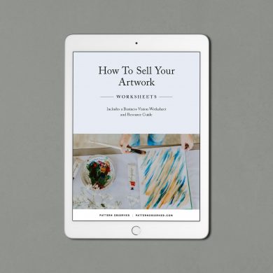 How To Sell Your Artwork
$7.99
How To Sell Your Artwork
$7.99