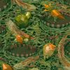
Apparel TextilesCreative EntrepreneurshipTextile DesignersSilk Scarves from Mon Lien AtelierMon Lien Atelier came to fruition in 2022 with a niche product... Read More
Creative EntrepreneurshipTextile DesignersAmanda Corcoran Designs Quilting FabricAmanda Corcoran is a self taught designer and mother of three who... Read More
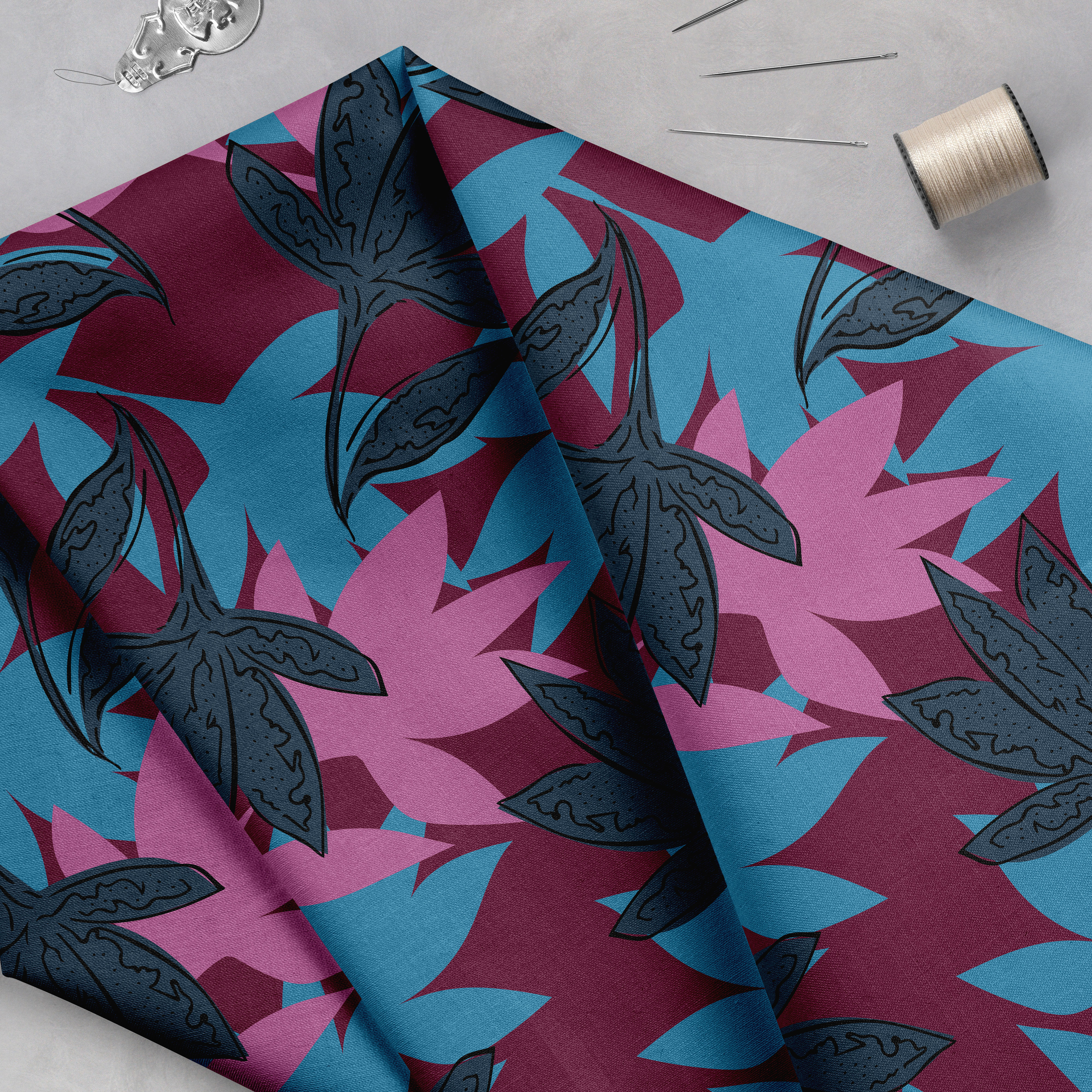
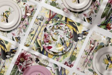
Apparel TextilesBrand SpotlightCustom Digital Printing with Raspberry Creek FabricsRaspberry Creek is a digital fabric printer focused on apparel and wallpaper.... Read More
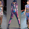
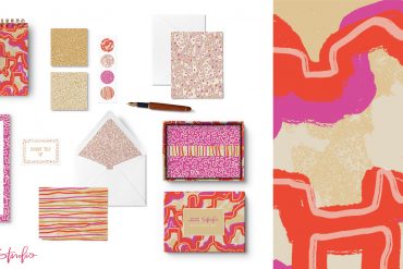
Apparel TextilesBrand SpotlightCreative EntrepreneurshipFashionFunky & Maximal Patterned Products From WXY DesignWXY Visual Design is a collaboration between two friends who met as... Read More
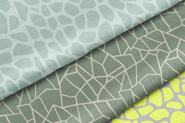
ArtistsCreative EntrepreneurshipHome DecorTextile Design Lab Member SpotlightSculptural Surface Design from AmartiAndrea Martinez is the creative behind Amarti, a design studio that focuses... Read More
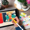
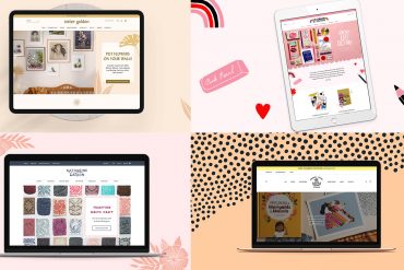
Building Your Textile Design BusinessBusiness TutorialsCreative EntrepreneurshipTextile Design LabGoals Setting Group Study & Business DevelopmentThroughout 2022 our Textile Design Lab community focused on finding work as... Read More
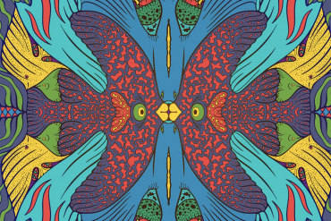
ArtistsTextile DesignersEscape to Sam Wilde’s Surreal WorldWe are delighted to take you through a wildly delightful visual journey... Read More
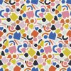
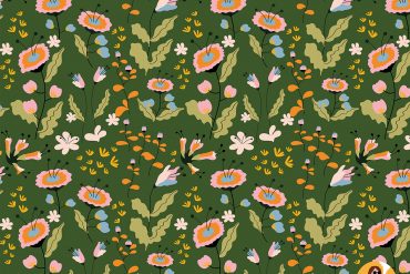
ArtistsTextile DesignersClaire Iglesias Makes Lively CompositionsClaire Iglesias is a surface pattern designer and maker from Brittany, France... Read More
Creative EntrepreneurshipGuest Expert TrainingHome DecorAn Evolving Design Business with Misha ZadehMisha Zadeh is a seasoned designer who knows how to pivot her... Read More
Creative EntrepreneurshipGuest Expert TrainingSandra Mejia’s magical worldSandra Mejia (formerly Bowers) is a Colombian artist living in British Columbia,... Read More
Textile Design LabUpcoming Event: Selling Your Work MonthOctober is fast approaching and we are excited to announce a special... Read More
Apparel TextilesCreative EntrepreneurshipFashionGuest Expert TrainingHome DecorInterviewsPappenpop Does It All!!Pappenpop is a print design studio that sells artistic patterns for all... Read More

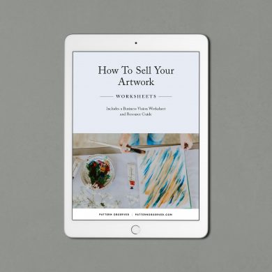 How To Sell Your Artwork
$7.99
How To Sell Your Artwork
$7.99